
Branding + Design + UI/UX + Illustration
Wellcovered Insurance
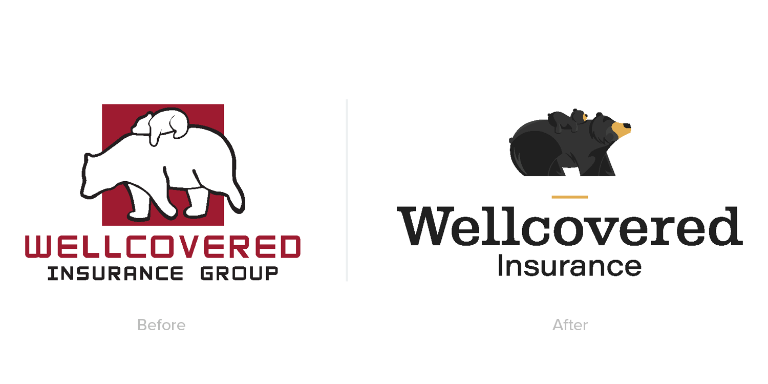
Wellcovered Insurance already had an existing logo when they approached me—but they were ready for a brand refresh that would give their visual identity more warmth, character, and emotional connection. The goal was to retain the essence of their brand while reimagining it in a way that felt more relatable, modern, and memorable.
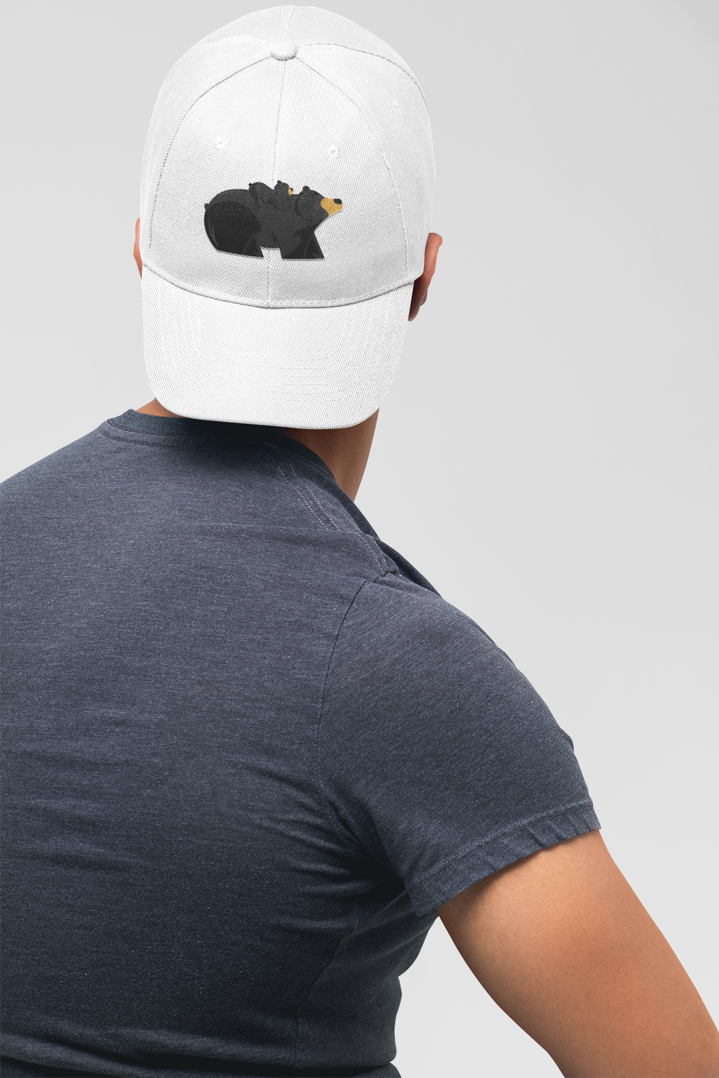
The inspiration behind the refreshed logo centered on the idea that Wellcovered “has your back”—a trustworthy, supportive partner that carries you through life’s uncertainties. This concept came to life through the illustration of a mama bear and her cub, symbolizing protection, guidance, and care. The bear imagery also has local relevance, as it reflects the native black bear population here in Florida, helping to ground the brand in a sense of place.
I applied my illustration and branding skills to carefully craft a logo that was both expressive and functional. While the logo is illustrative in nature, it remains simple and iconic enough to work across all applications. Using a geometric circle-based structure, I achieved a sense of balance and harmony in the bear figures, giving the logo a polished yet friendly appearance.
Typography also played a key role in the refresh. The original brand used a heavy slab serif, and while I wanted to evolve the look, I didn’t want to stray too far from the foundation. To maintain continuity while softening the tone, I chose Albiona, a more organic and subtly playful slab serif. This updated typeface complements the logo’s curves and reinforces the approachable, dependable personality of the brand.
The new logo became the creative springboard for the rest of the brand system. I developed a series of custom illustrations—trees, clouds, birds, and service-specific icons (auto, property, business)—all in the same hand-drawn style to maintain consistency and charm. These illustrations aren’t just decorative; they bring the brand to life, both in print and digital spaces. On the website, they even feature gentle animations, adding a sense of whimsy and delight to the user experience.
The refreshed color palette, led by the deep charcoal and warm gold tones found in the logo, was expanded and applied throughout the brand to unify the visual identity. The result is a brand that feels trustworthy, personable, and uniquely memorable—just like the people behind Wellcovered Insurance.

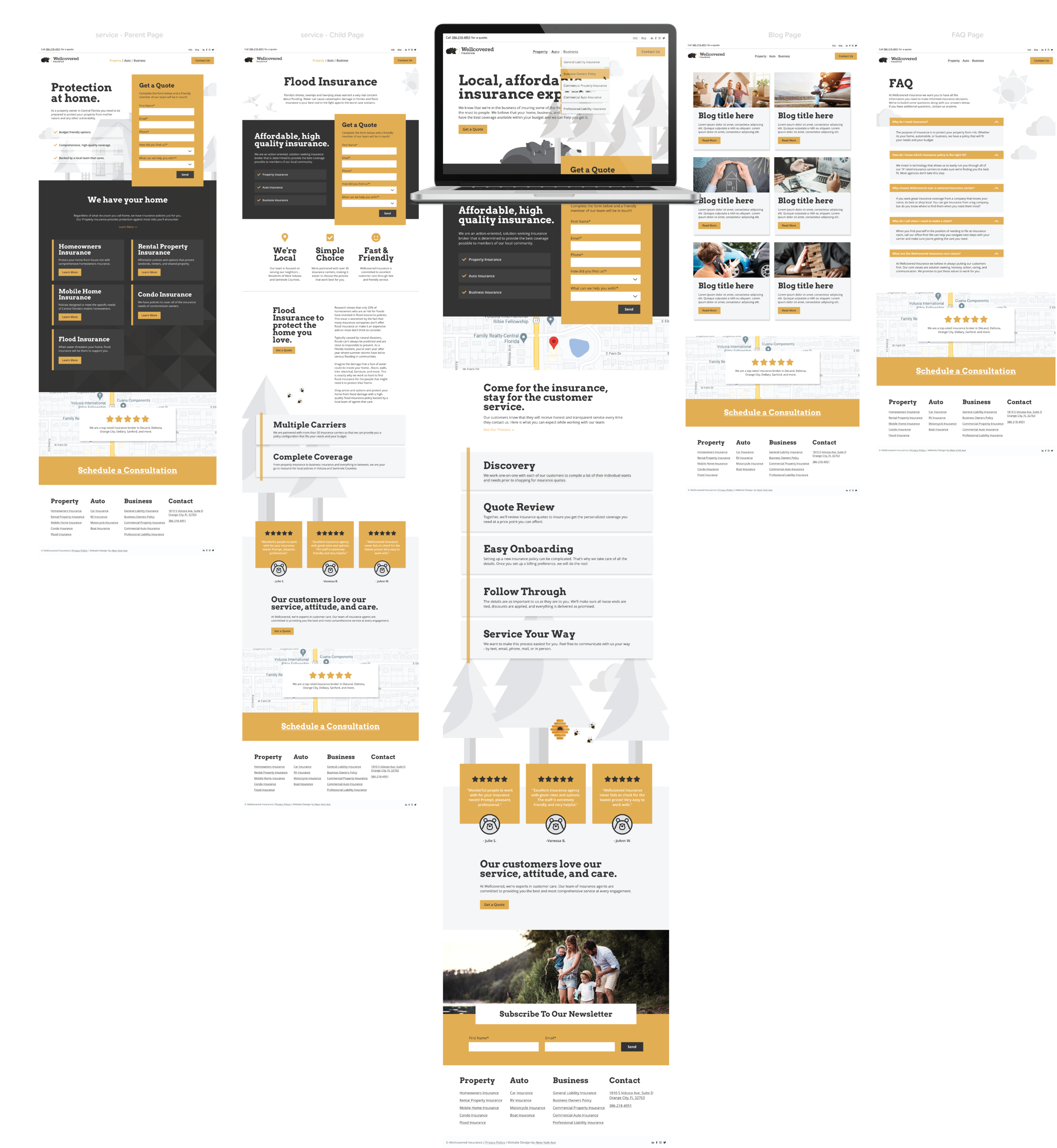
The website is often the most vital piece of a company’s marketing and advertising strategy—it’s where first impressions are formed, decisions are made, and trust is built. That’s why I approach web design not as a standalone task, but as an extension of the brand itself. After establishing the core visual identity and brand assets, I carry that system forward into the website, ensuring consistency in tone, style, and user experience.
Using the brand’s established look and feel—its color palette, typography, illustration style, and visual language—I design a website that is both visually cohesive and user-friendly. The brand elements don’t just decorate the site; they influence how users engage with it, guiding navigation and supporting key messaging through thoughtful layout and structure. From intuitive page flows to strategically placed calls-to-action, every element is designed to enhance clarity and encourage interaction.
The mockups below were created in Adobe XD to provide a clear, high-fidelity preview of the final site before development begins. These mockups allow stakeholders to visualize how the brand will come to life online—from homepage to key subpages—and serve as a collaborative tool for refining design decisions. By working through this stage with intention and detail, I ensure that the transition to development is smooth and the final product remains true to the vision.
Ultimately, the website becomes more than just an online presence—it becomes a living expression of the brand, delivering both function and feeling in equal measure.

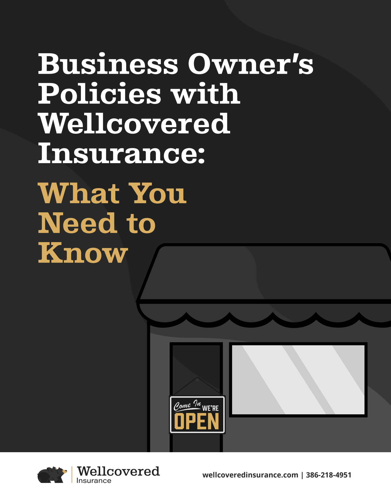
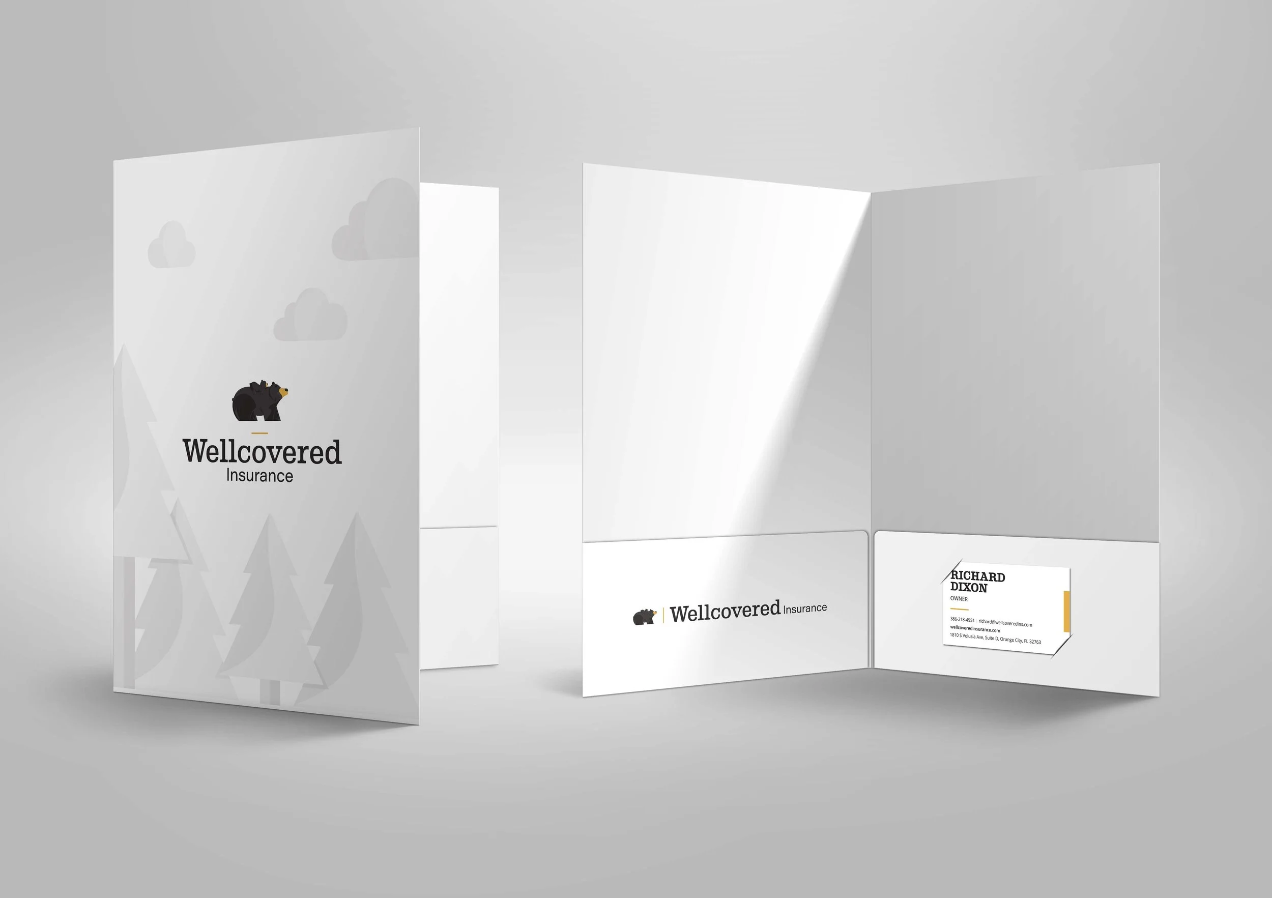


Below is a gallery of the illustrative assets I created for not only the website and stationary but rest of the brand. The illustrative style brings the brand to life and shows even insurance can be interesting! The illustrative style is fun and playful but also mature and serious enough as to appeal to it’s adult customers and feels appropriate.


© New York Ave. and Wellcovered Insurance