
Branding + Design + UI / UX
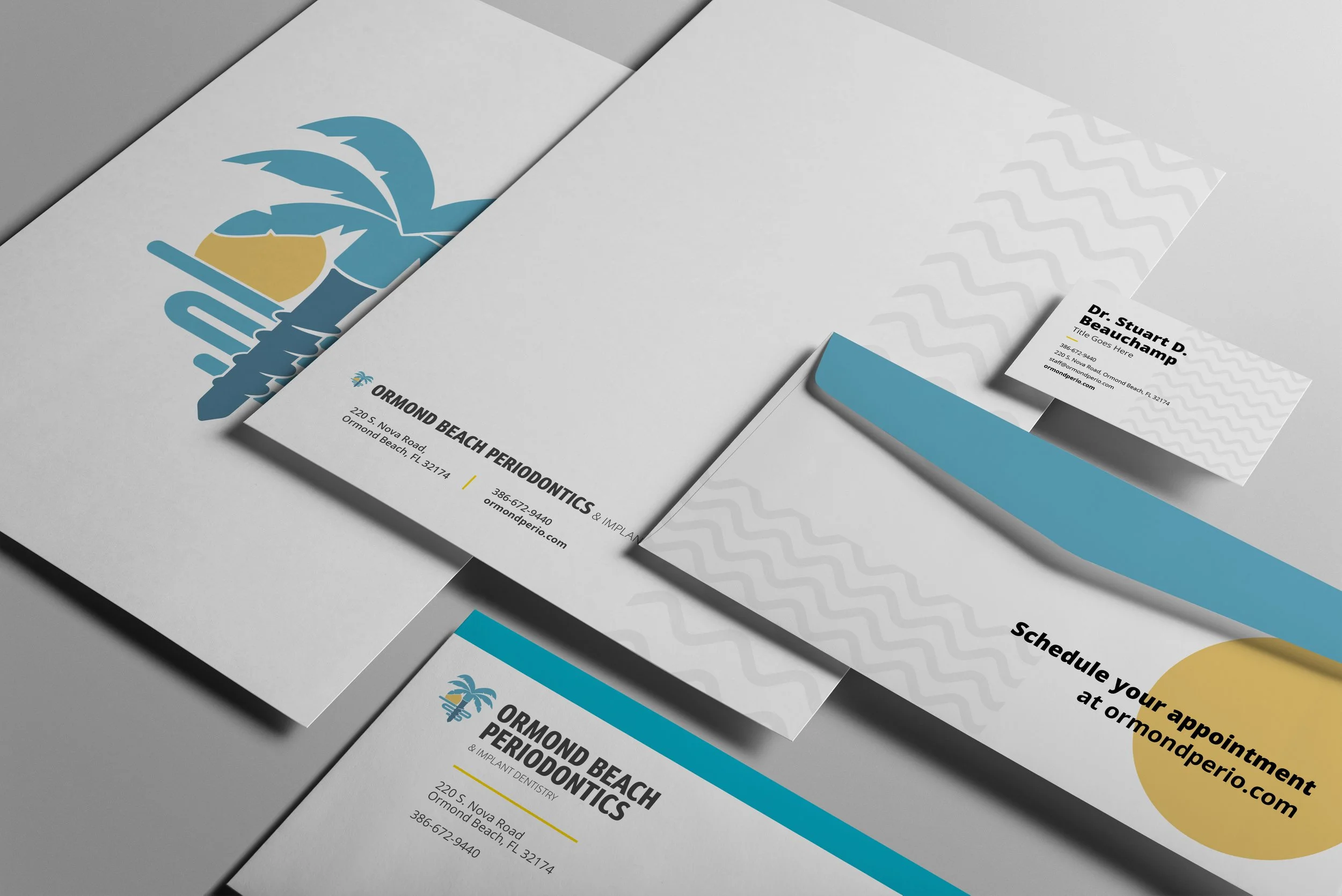
Ormond Beach Periodontics
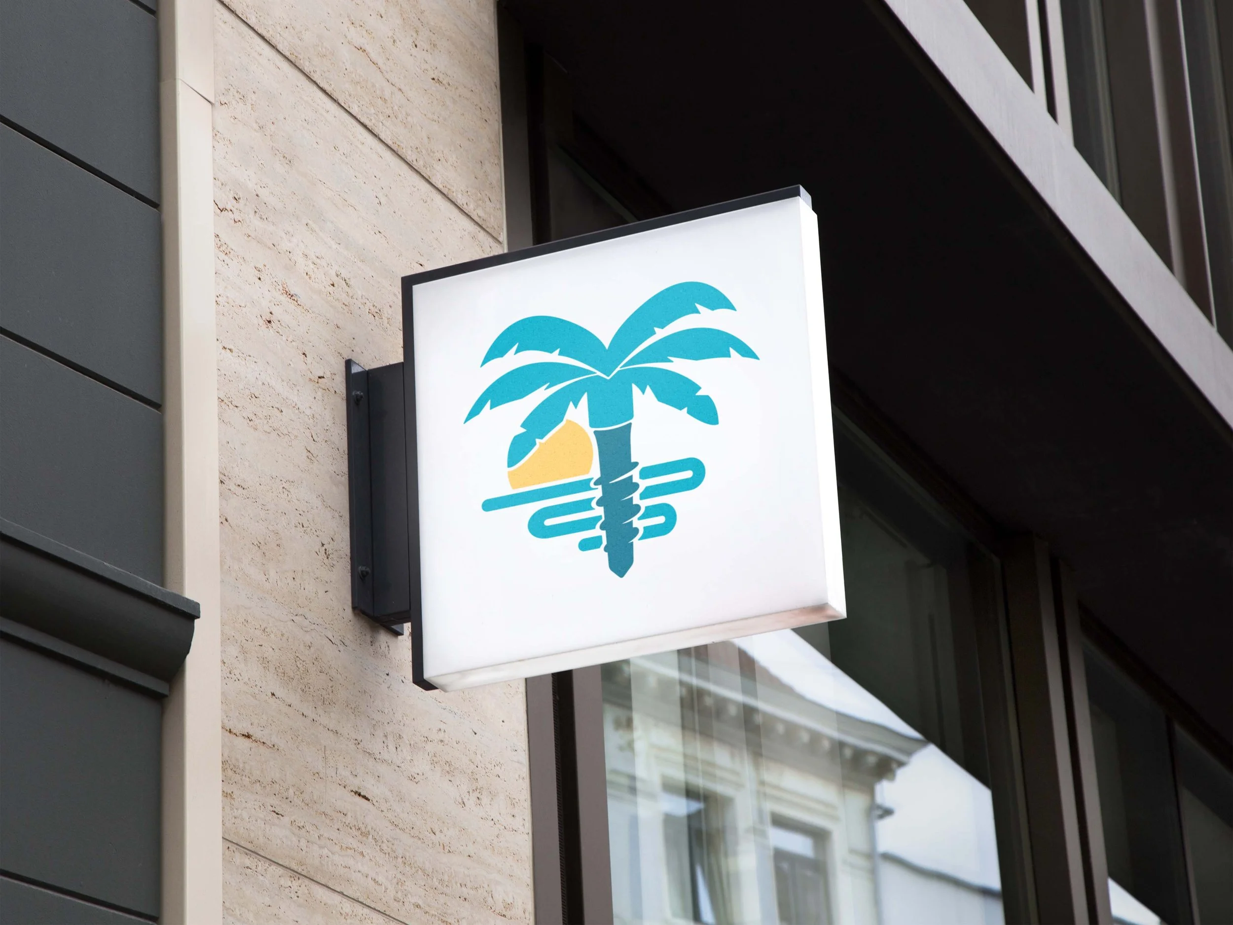
Ormond Beach Periodontics is a dental practice specializing in implant dentistry, located just steps away from the beach. Naturally, the brand needed to reflect its coastal roots while maintaining a professional and trustworthy presence. When I was brought in to help design the logo, the client specifically requested a concept that blended dental implants with a beach element—initially envisioning an implant fused with a beach umbrella.
After exploring several iterations, I found that combining a beach umbrella with an implant created visual imbalance and lacked clarity. Instead, I proposed a more refined and cohesive idea: merging the form of a dental implant with a palm tree. This solution not only made for a stronger, more symmetrical mark, but also captured the essence of the location in a way that felt natural and visually engaging.
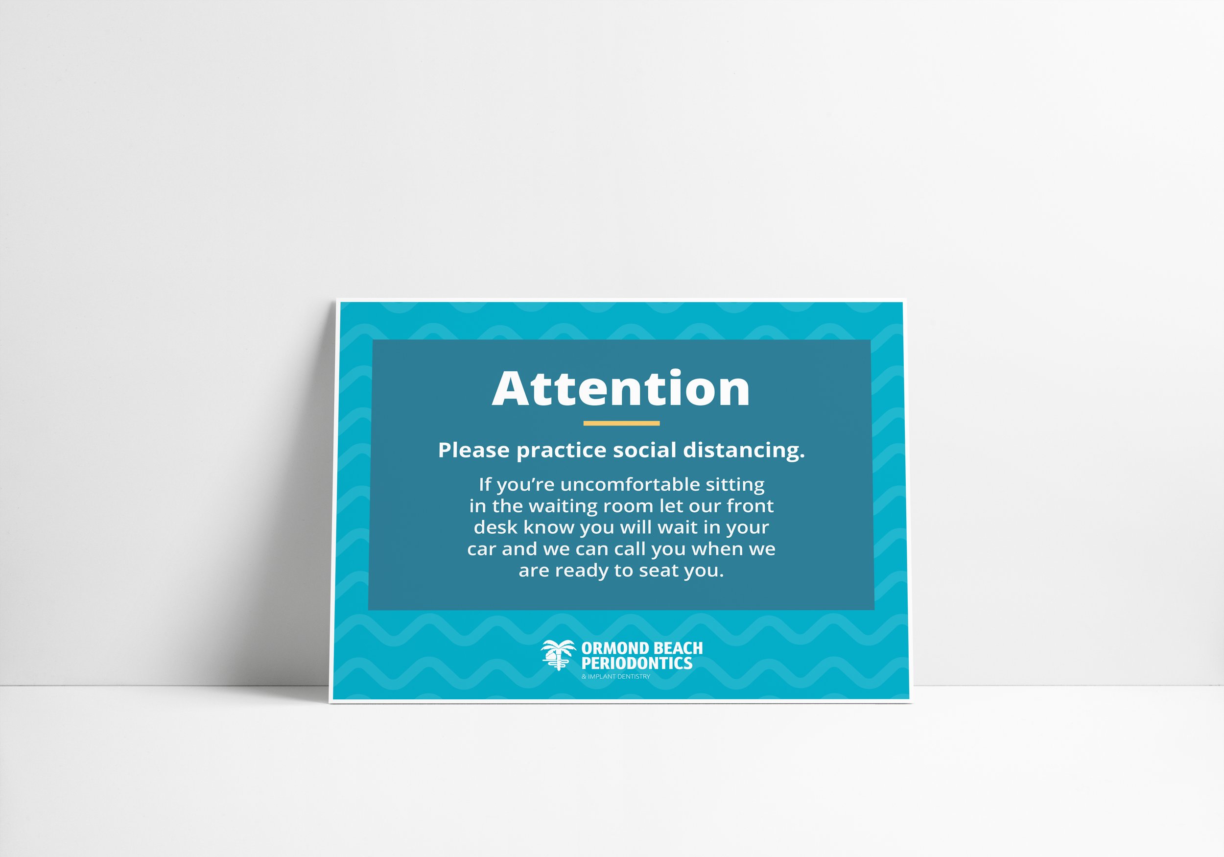
The color palette was inspired by the surrounding environment—soft ocean blues, sandy neutrals, and sun-washed tones—to create a soothing, approachable aesthetic. To further support the brand, I developed an abstract ocean-inspired pattern that could be used across marketing materials, digital platforms, and print collateral. This pattern adds texture and depth to the brand while reinforcing the connection to the beachside location.
Overall, the branding strikes a balance between coastal charm and professional sophistication, helping Ormond Beach Periodontics stand out while still instilling confidence in its expertise and care.

For Ormond Beach Periodontics' website design, my goal was to create an experience that feels both welcoming and trustworthy. As a healthcare provider—especially one dealing with surgical procedures like implants—it’s essential that the website instills a sense of confidence while also making potential patients feel comfortable and at ease.
To build trust and professionalism, I incorporated high-quality, professional photography throughout the site. These images not only showcase the practice and its team but also provide a sense of transparency and authenticity that reassures visitors. The clean, well-structured UI layout further reinforces that professionalism, making information easy to find and understand.
At the same time, I wanted to balance that confidence with warmth and approachability. Rounded corners, a bright and calming color palette inspired by the brand’s beachside identity, and an intuitive, user-friendly UX all contribute to a more inviting atmosphere. From the first click, users are guided through a thoughtful digital journey—learning about the practice, understanding their services, and ultimately feeling comfortable enough to take the next step in scheduling an appointment.
Every design choice was intentional, working together to reflect Ormond Beach Periodontics' commitment to expert care and patient comfort—resulting in a site that not only informs but also builds trust and connection with its audience.

© New York Ave. and Ormond Beach Periodontics