
Branding + Design + UI/UX + Illustration
LeCompte & Beauchamp Orthodontics
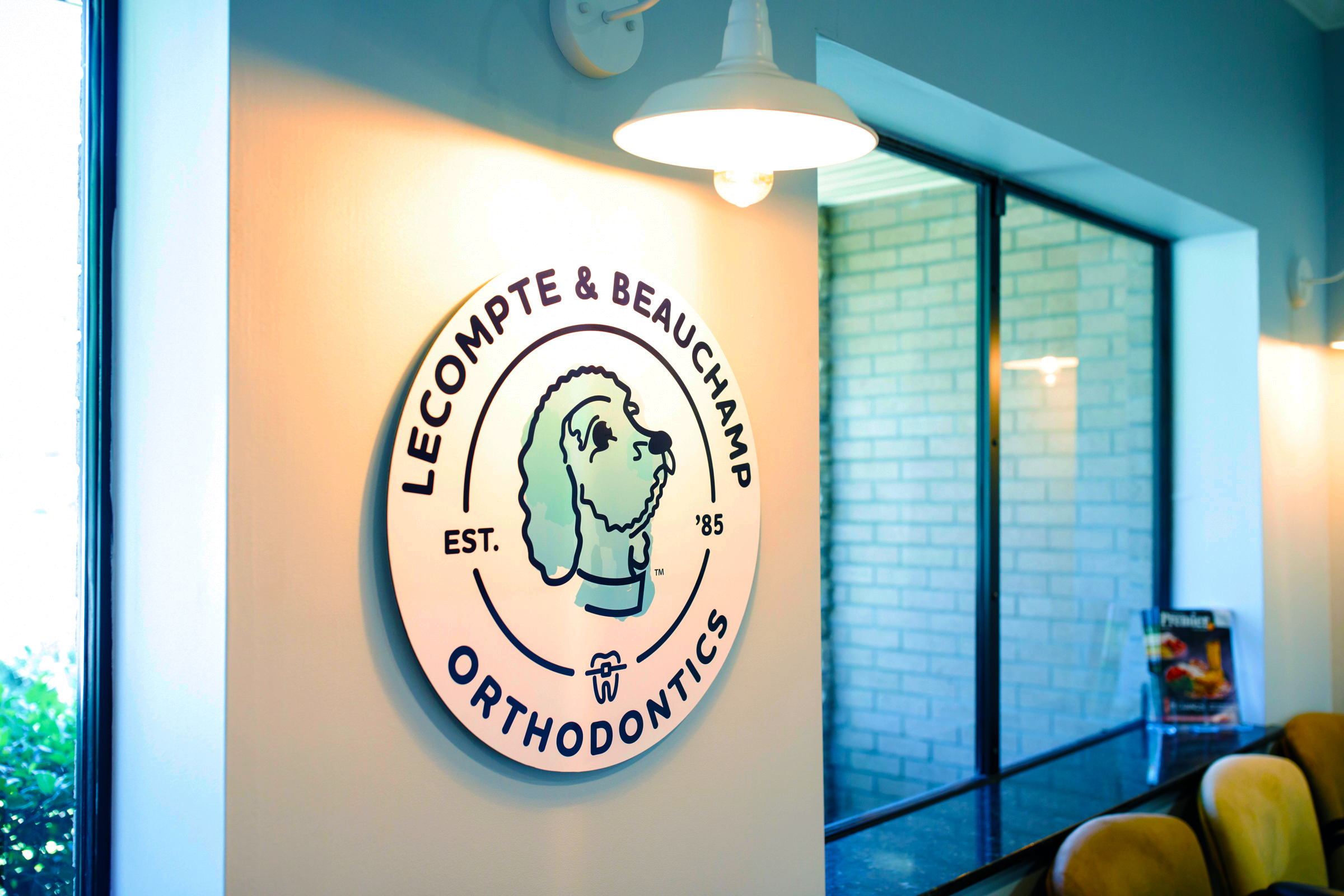
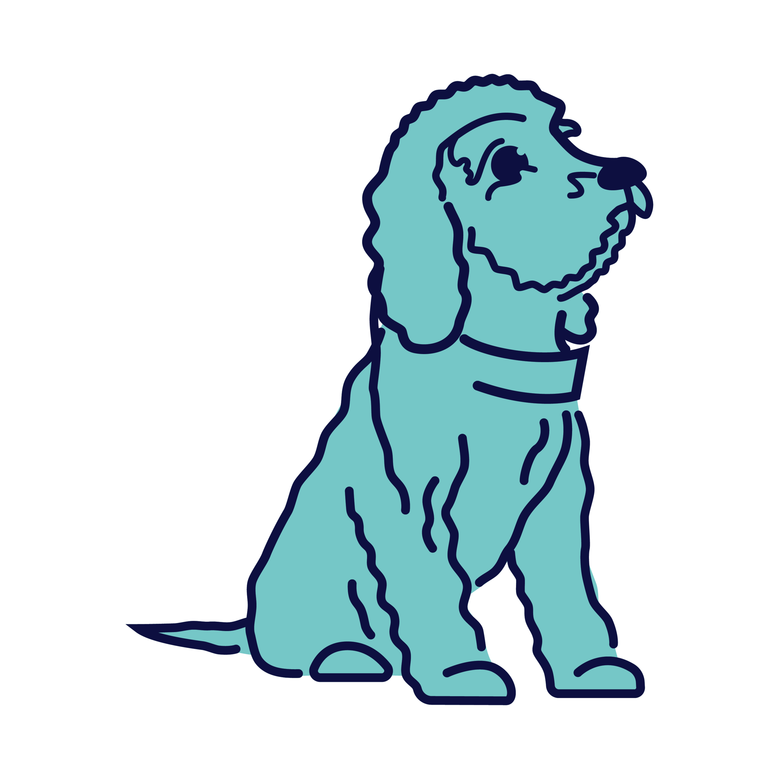
Lecompte and Beauchamp Orthodontics is a pediatric orthodontic practice specializing in braces for children. The owner was passionate about making her dog the face of the brand—a fitting choice given her young target audience. With kids in mind and a fun, energetic personality at the heart of the business, it was important for the brand to reflect that same spirit.
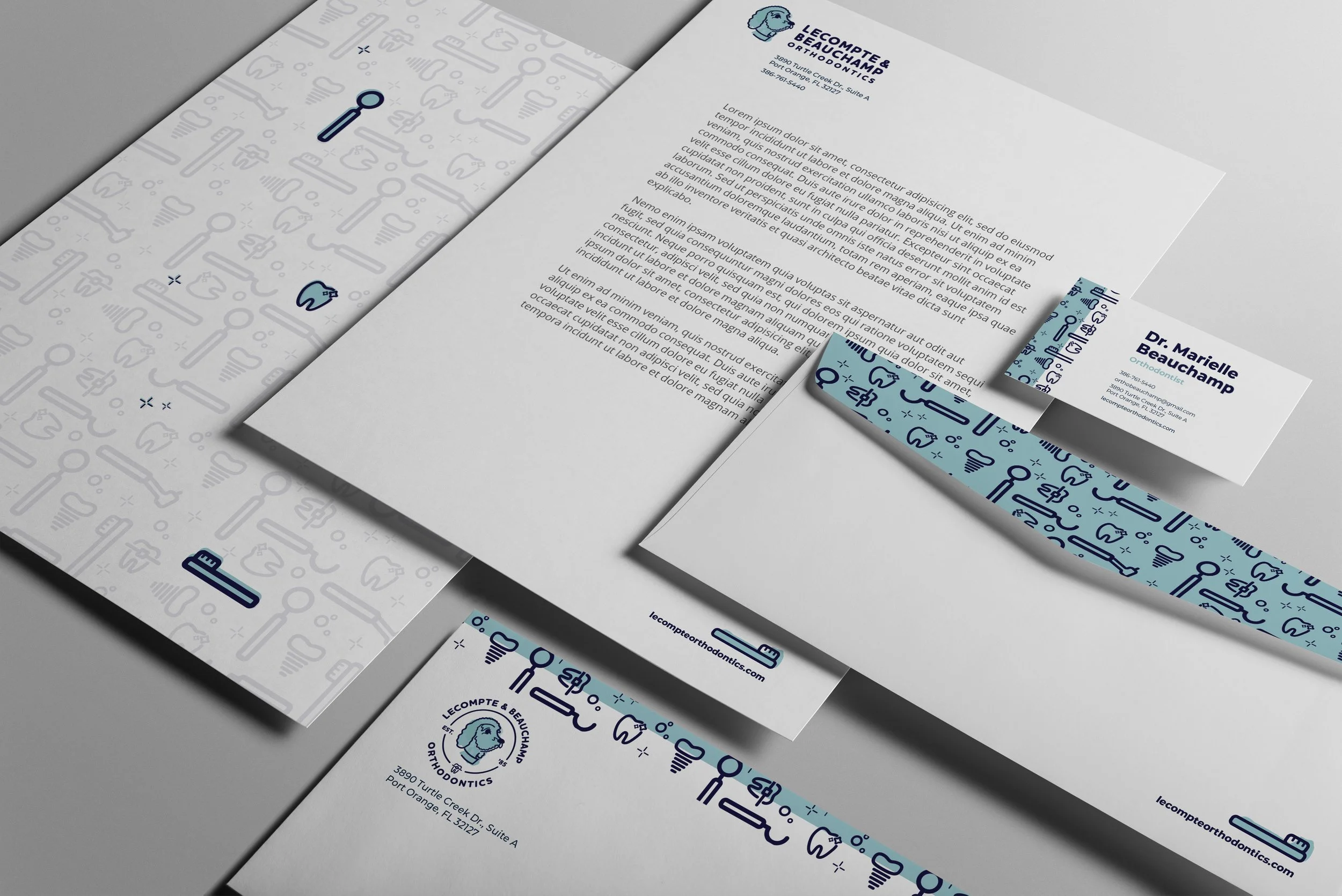
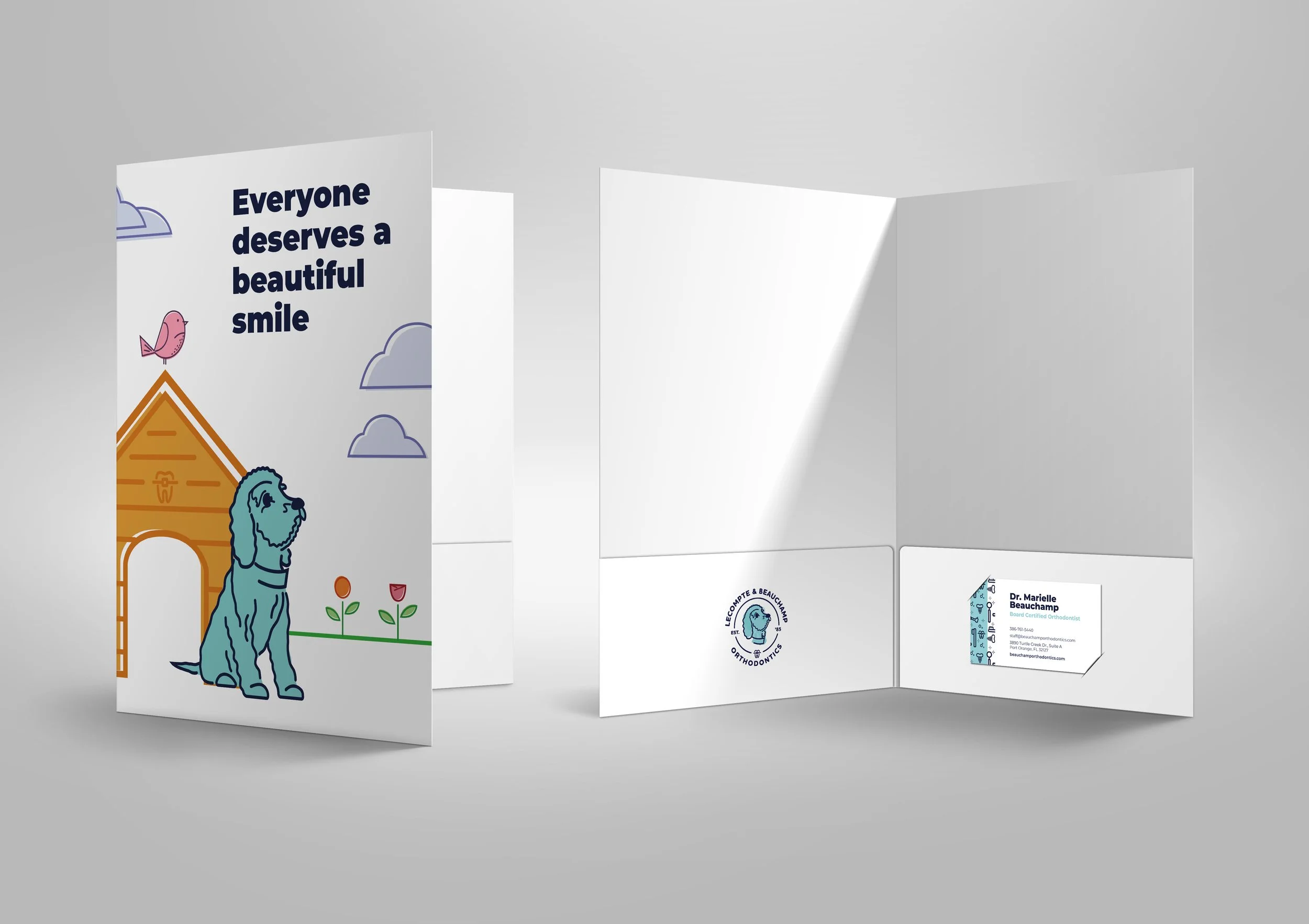
I chose a watercolor illustration style for the dog to evoke warmth and playfulness, incorporating a braced tooth to clearly communicate the practice’s focus. When selecting the typeface, I drew inspiration from the logo itself. The dog illustration featured soft, rounded, monotone lines, so I selected a typeface with similar characteristics to create visual harmony between the logo and typography.
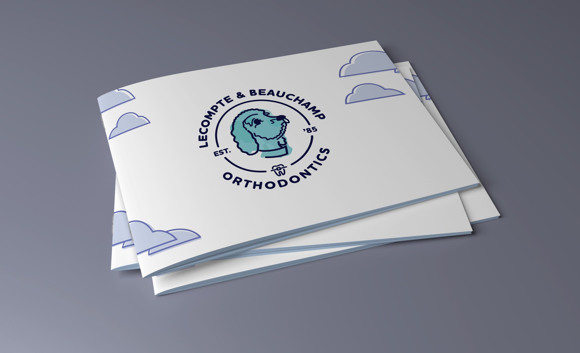
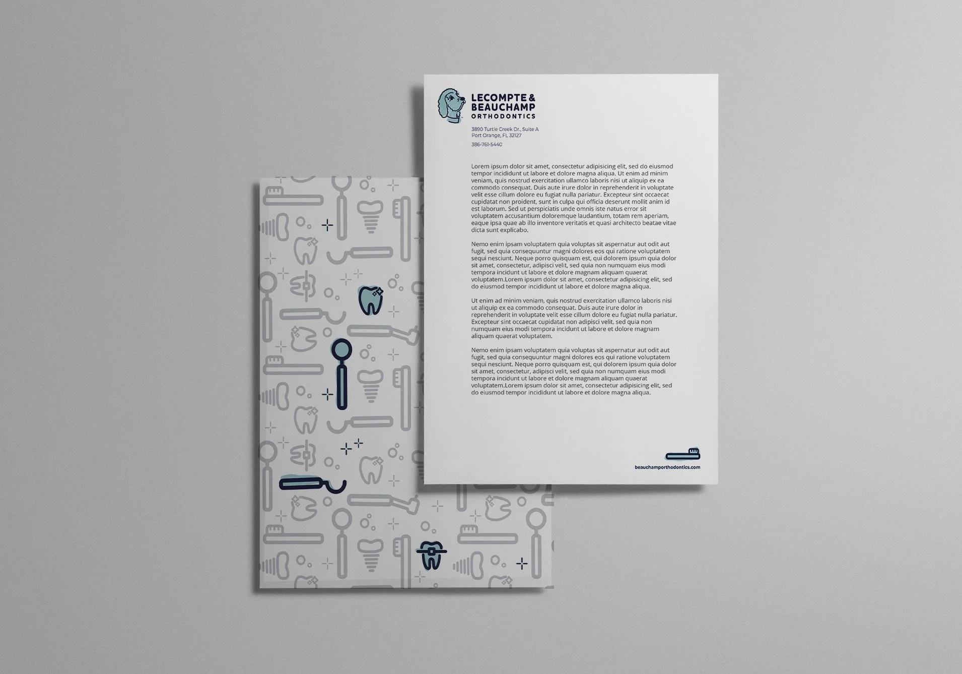
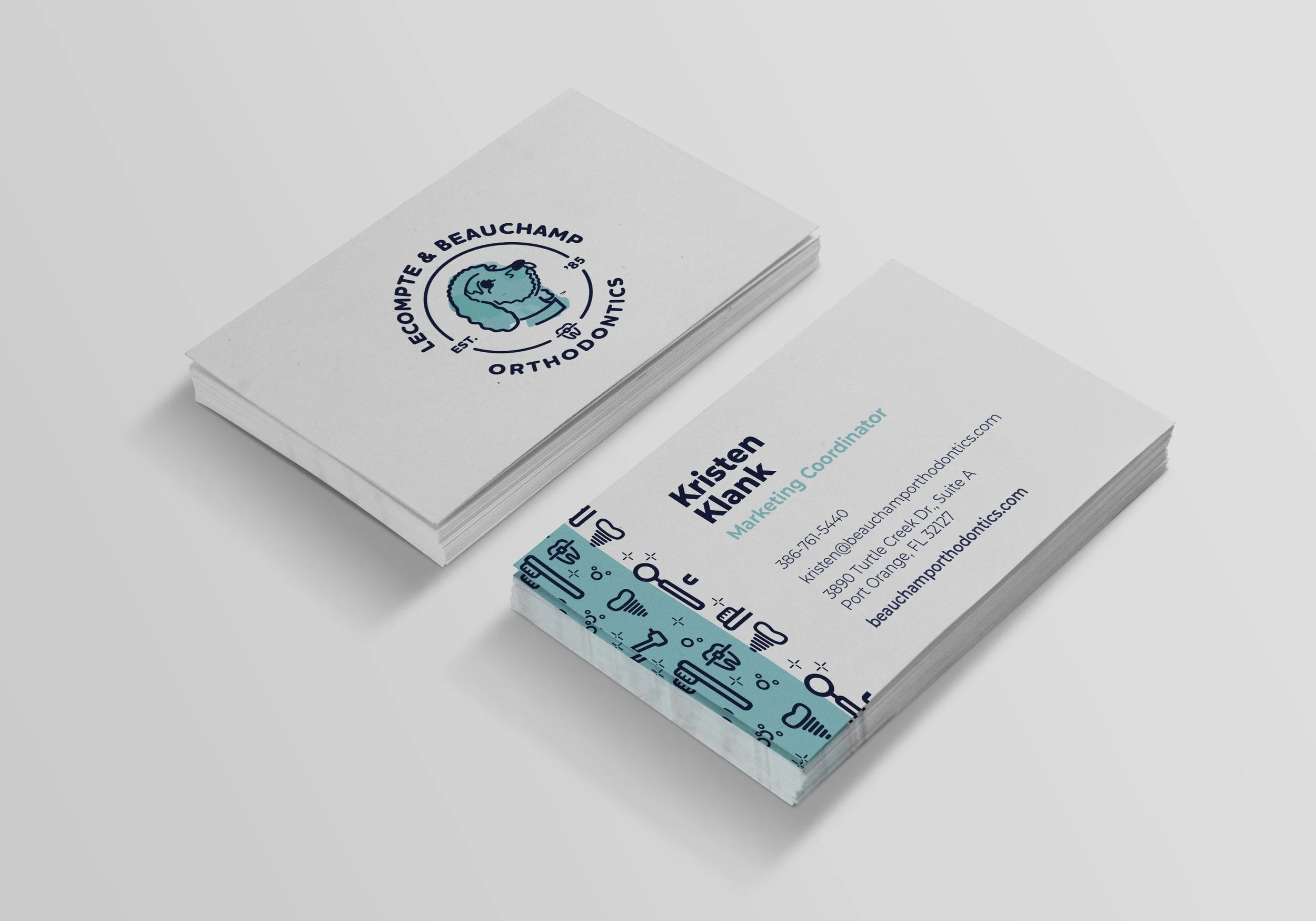
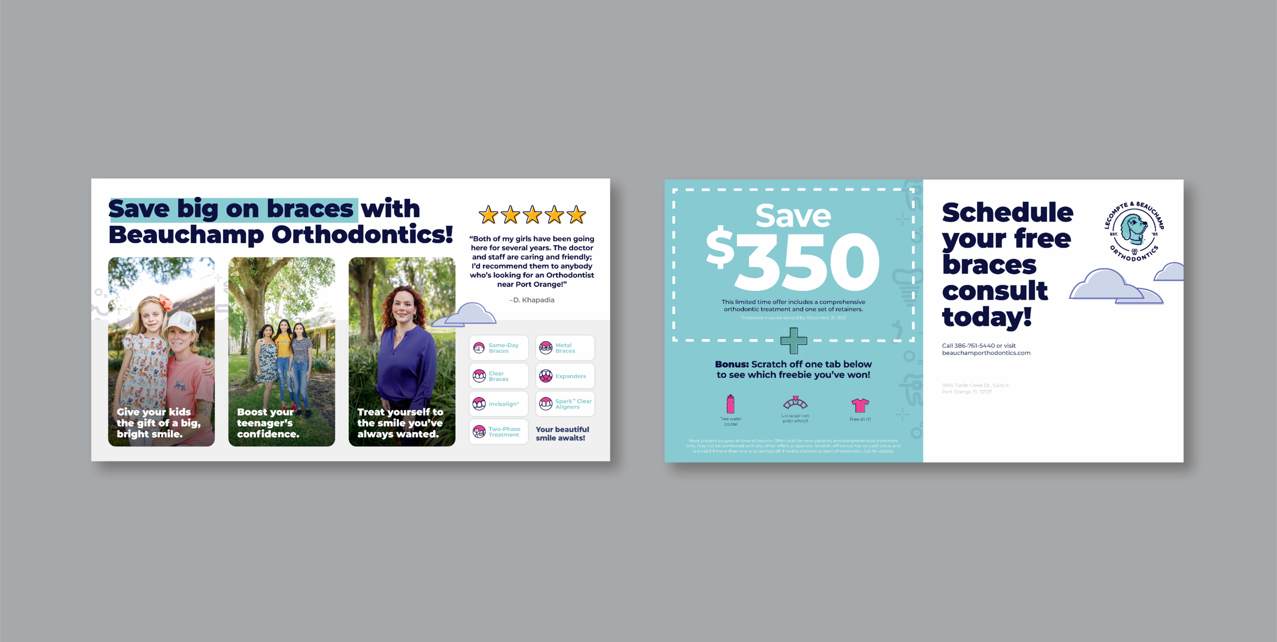
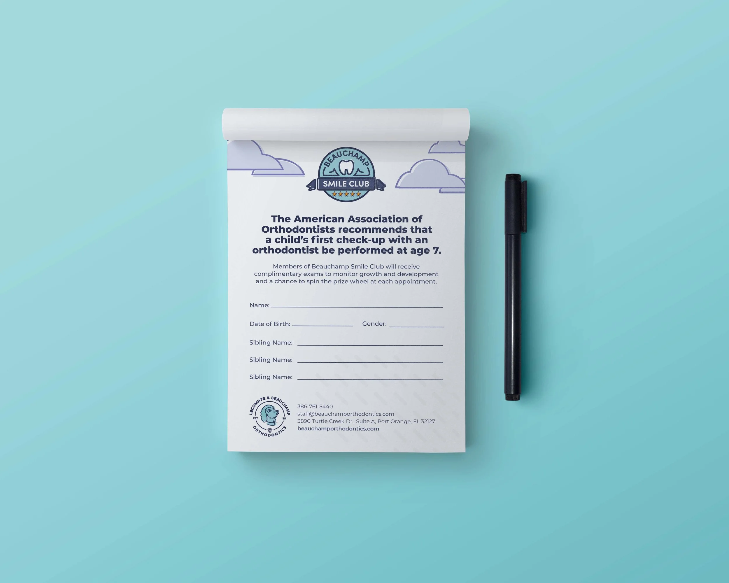
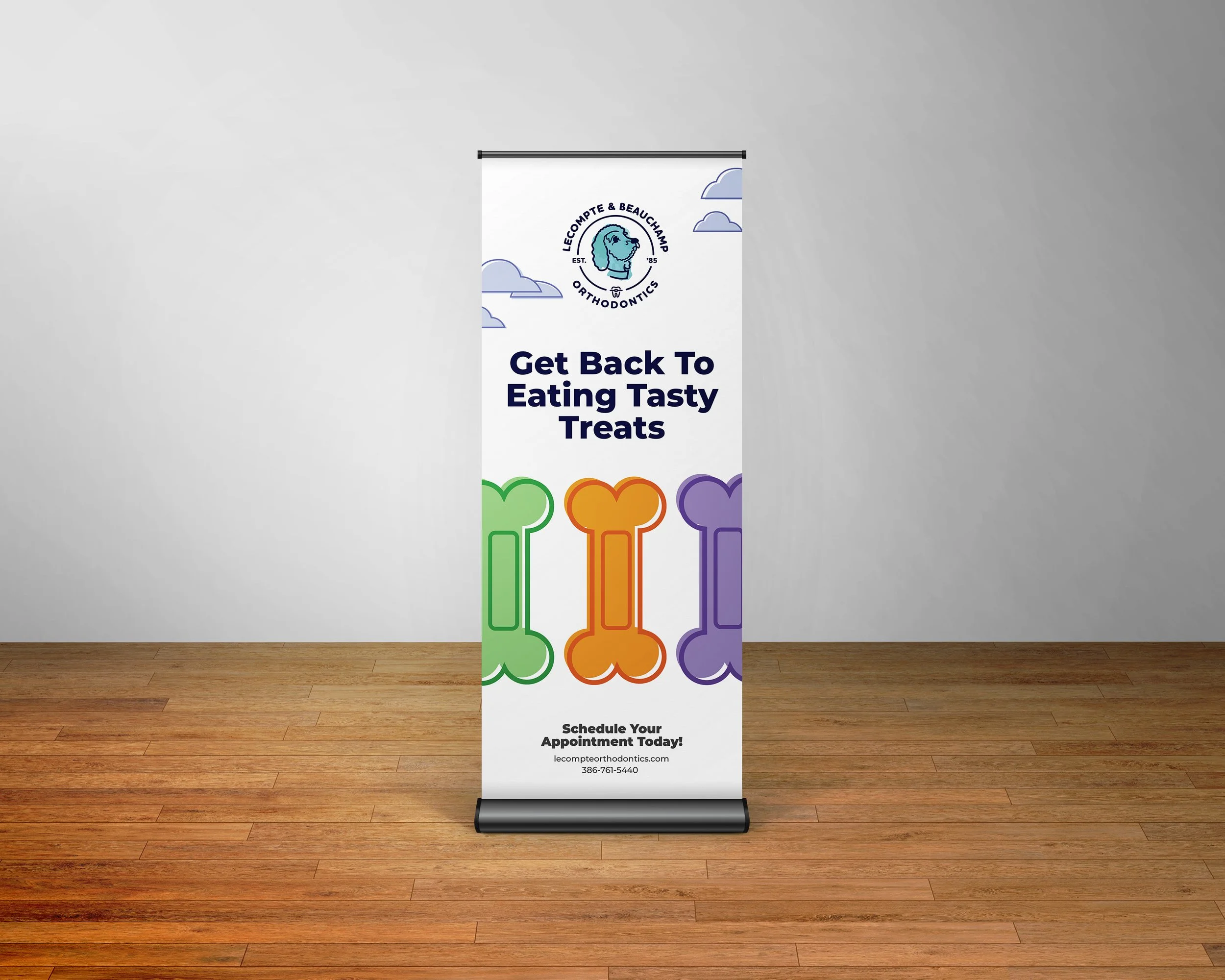
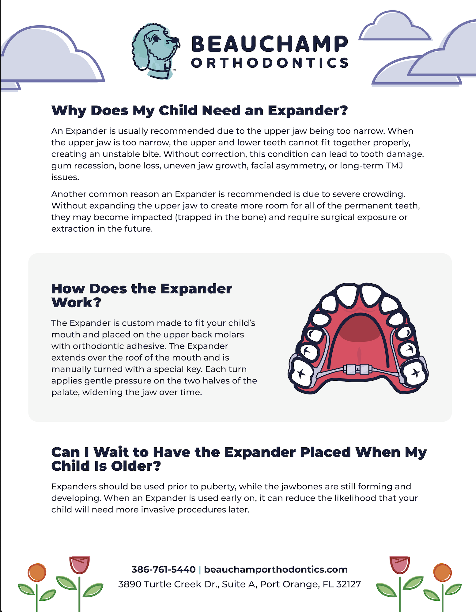
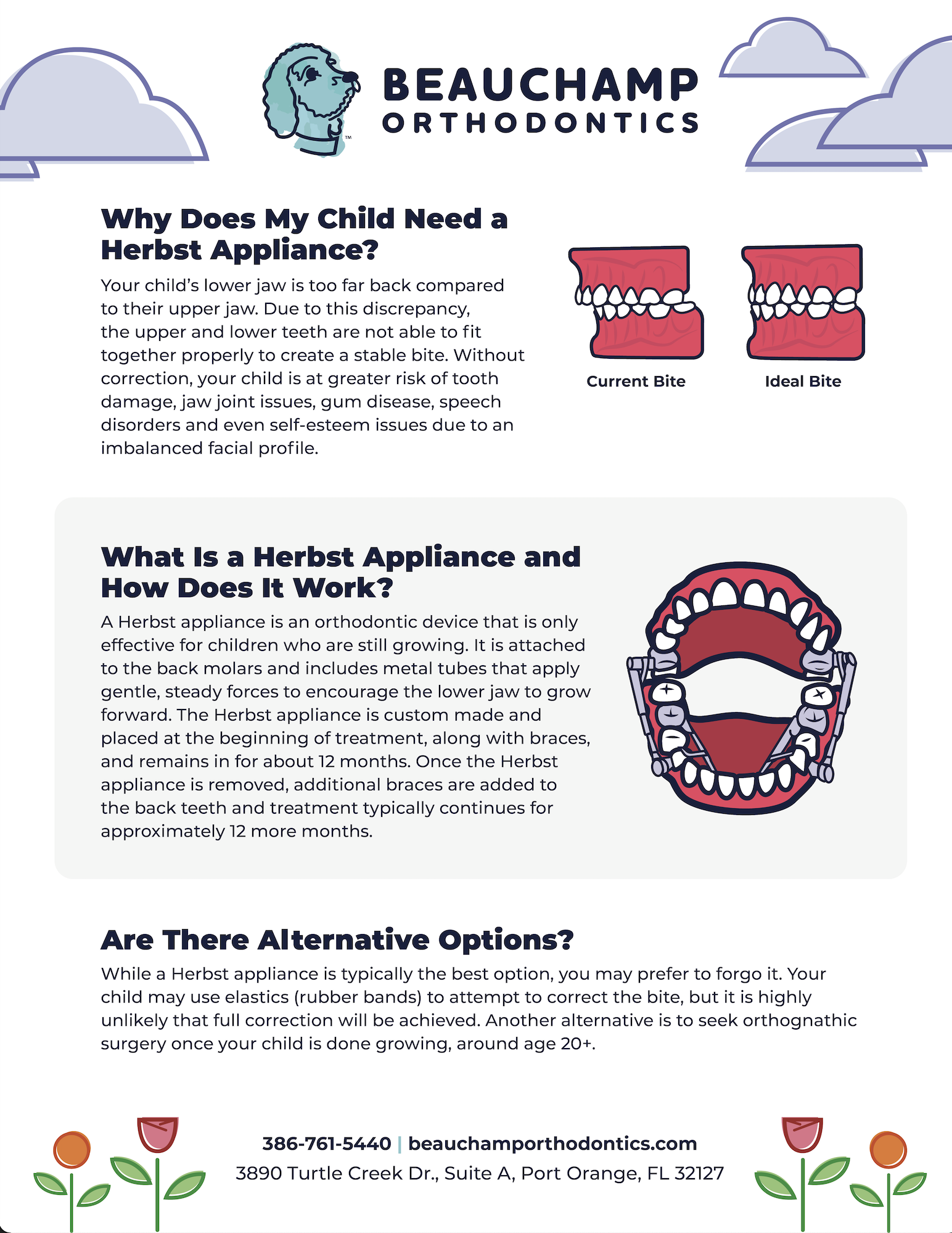
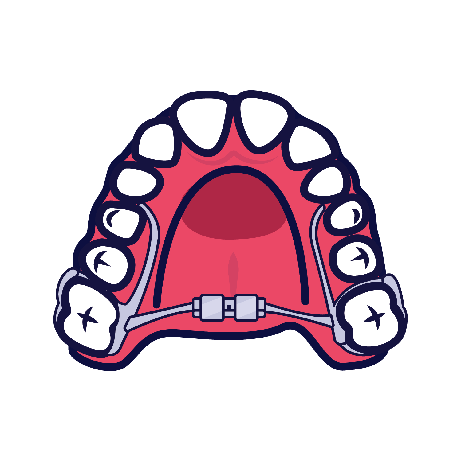
The logo served as the foundation for the broader brand system. I developed custom illustrations and a patterned design to unify the visual identity and present ideas in an engaging way. In a field like orthodontics, where procedures can be difficult to represent visually without appearing clinical or unappealing, a fun and approachable illustration style helps bridge that gap. This style not only resonates with children but also makes the brand more relatable and memorable for both kids and their parents.
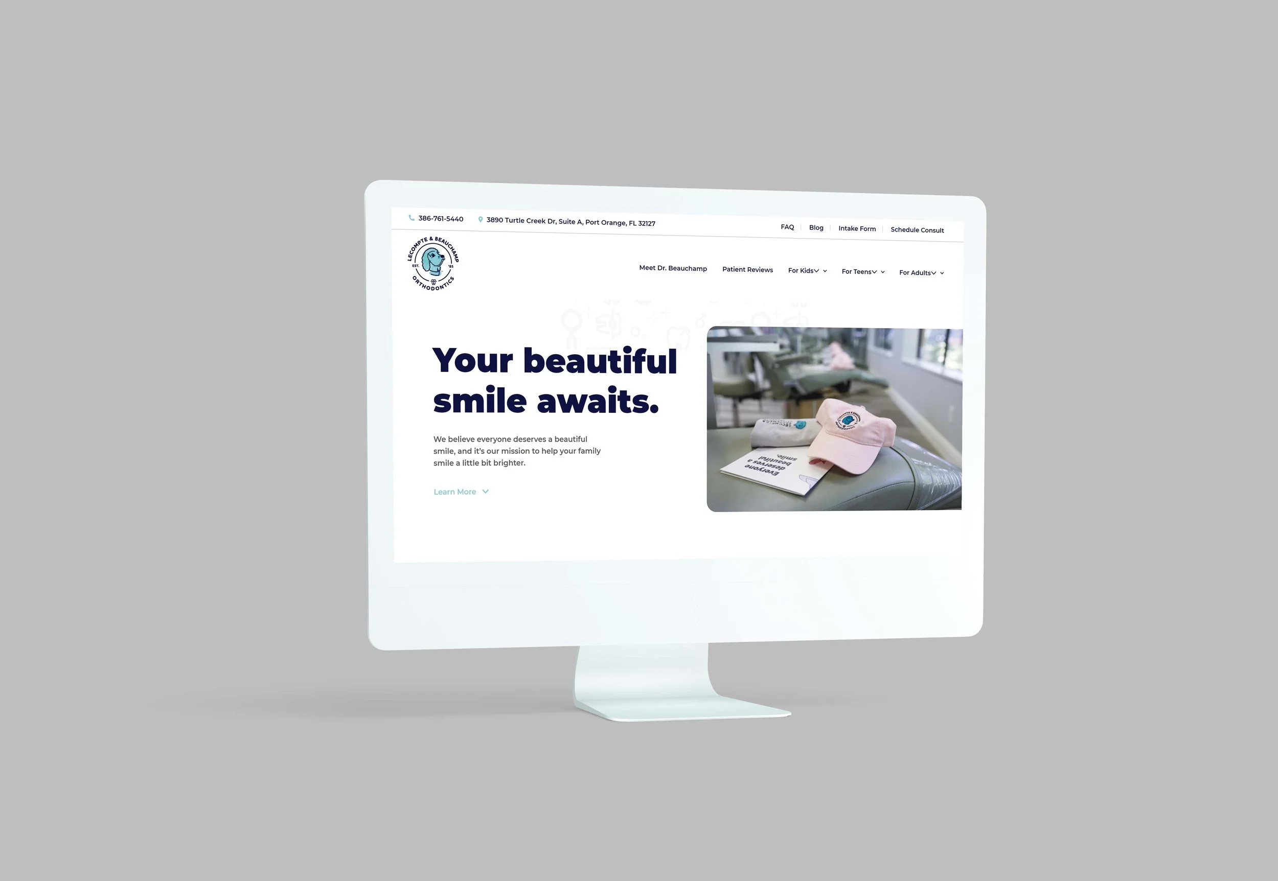
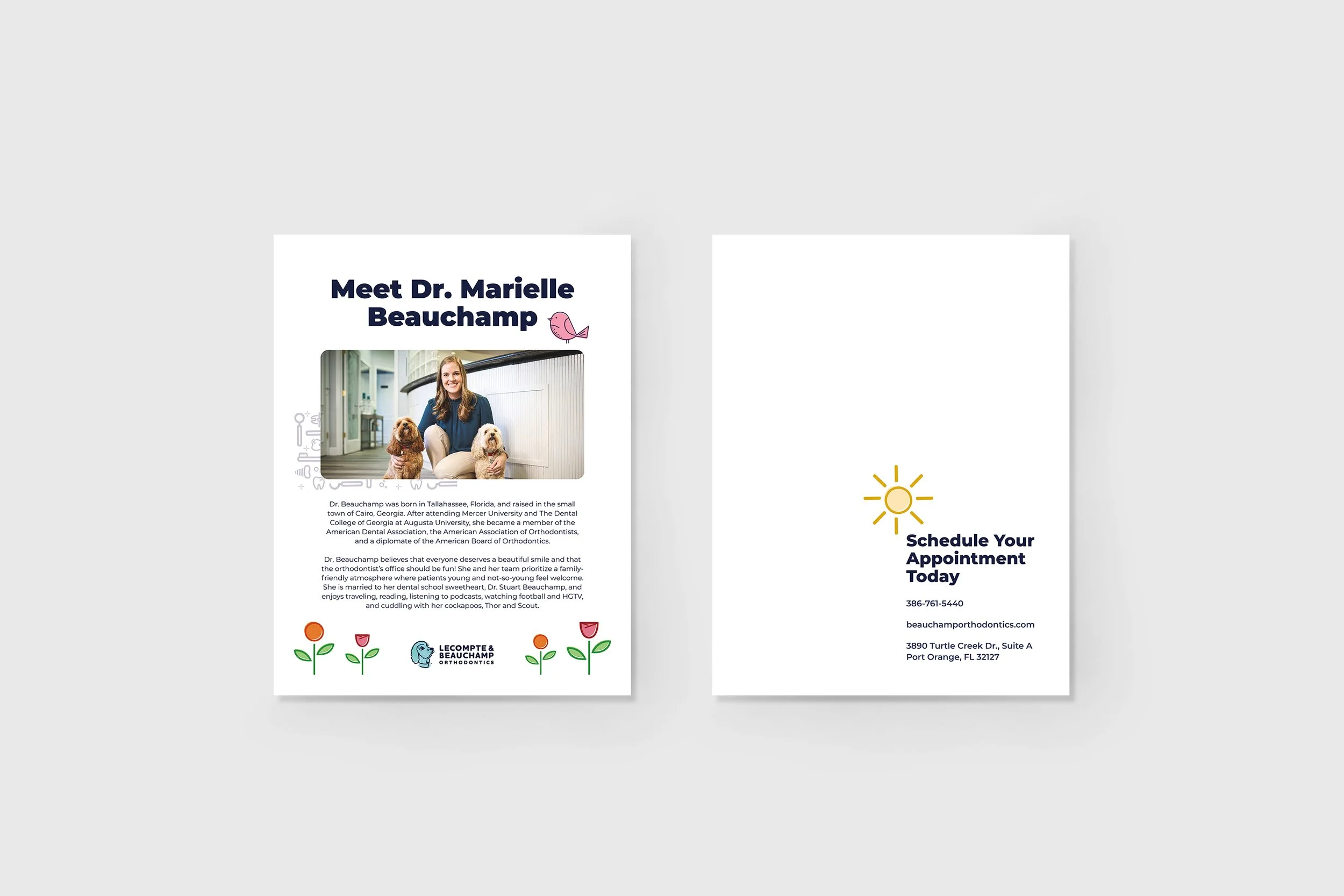
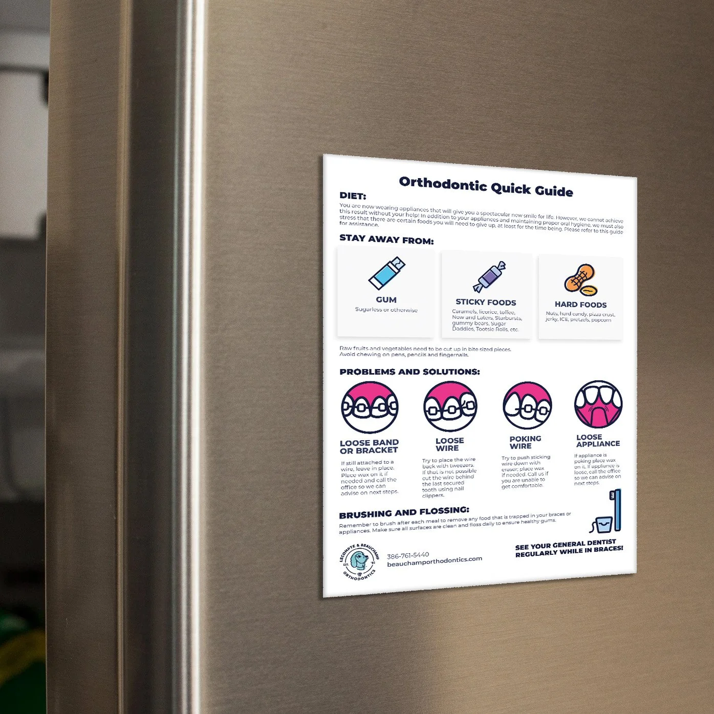
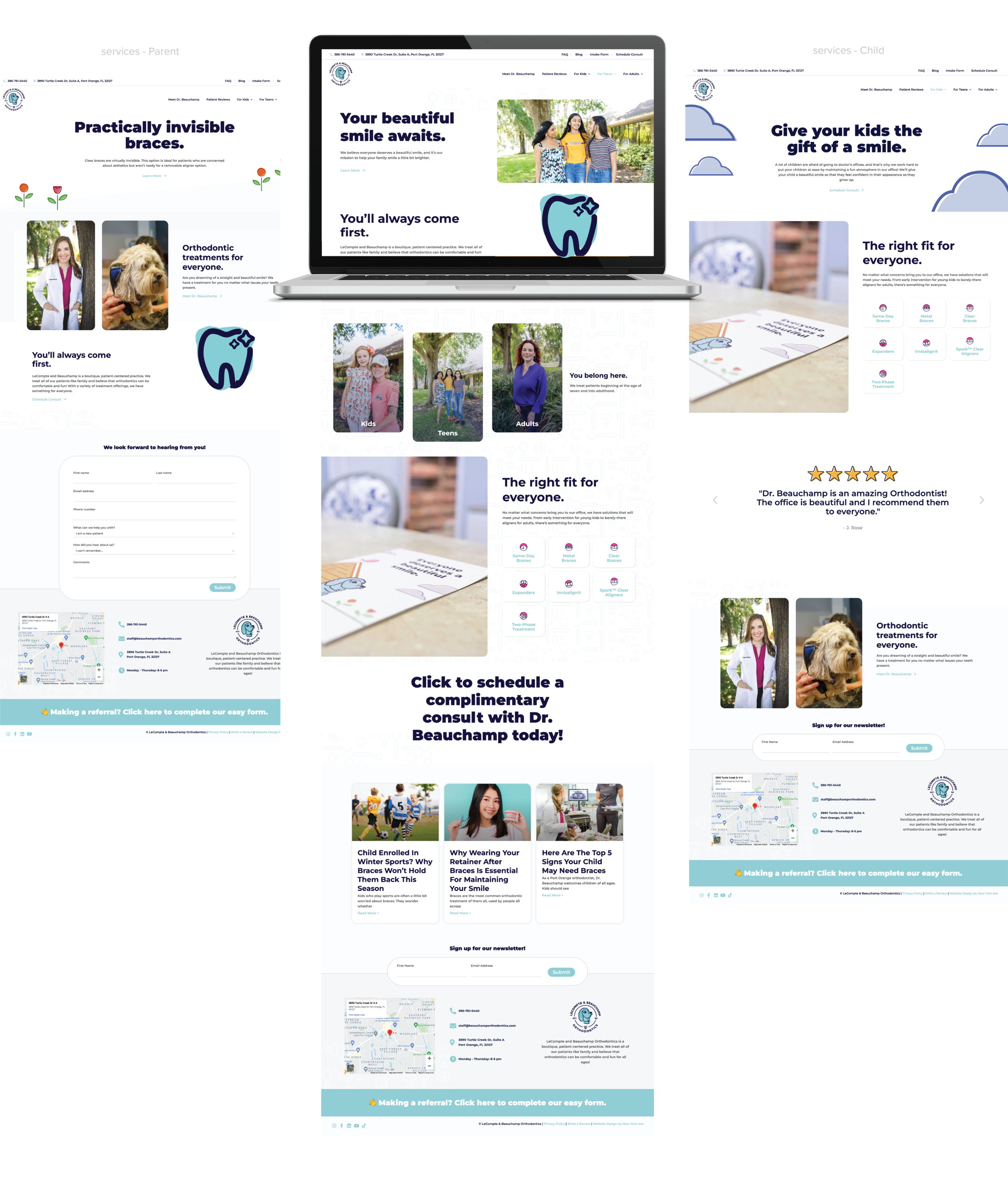
Below is the website design I created for LeCompte and Beauchamp Orthodontics. To maintain brand consistency and establish a clear brand voice, I infused as much personality from the logo into the overall design as possible. The logo is fun, playful, and illustrative, so I carried those qualities into the website by incorporating bold, custom-designed icons that match the logo's style.
The homepage is strategically structured to guide users through the content in a purposeful and intuitive way. It begins with an introduction to who LBO is and what they do, followed by a section on their target audience. Once users identify themselves as the intended clientele, they are encouraged to continue scrolling, where they’ll find information about the services offered, supportive messaging to reinforce the brand’s credibility, and finally, a clear call to action.
Each page of the website follows this same user-centered logic. I designed the layout to answer three key questions: Why is the user on this page? What information are they looking for? And how can that information be presented in a way that is clear, engaging, and answers their needs effectively?
Custom Brand Illustrations


© New York Ave. and LeCompte & Beauchamp