Branding + Design + UI/UX + Layout
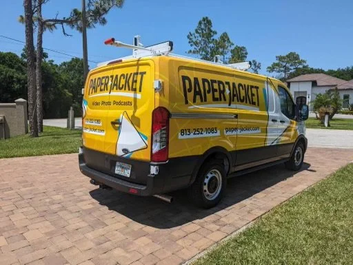
Paper Jacket

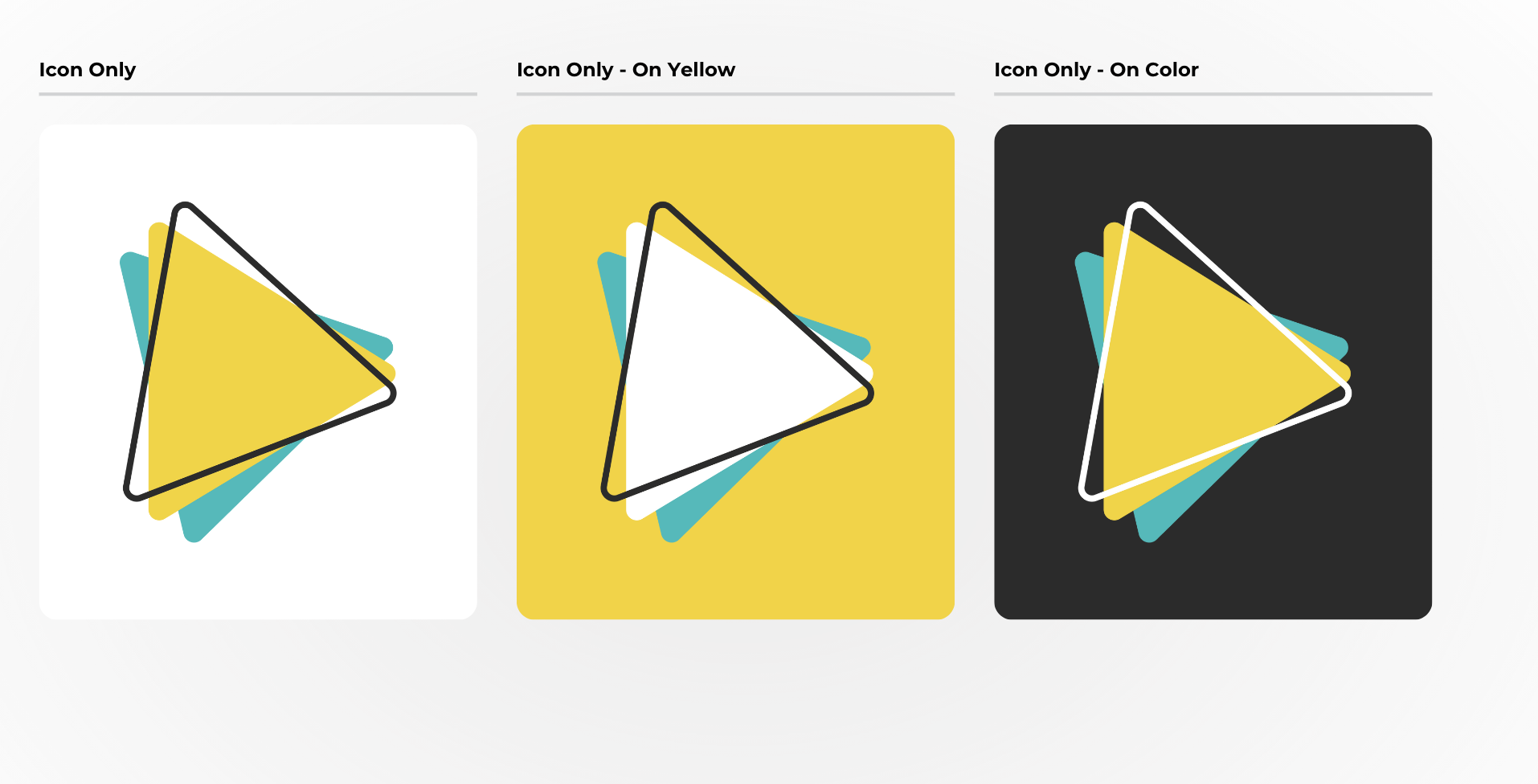
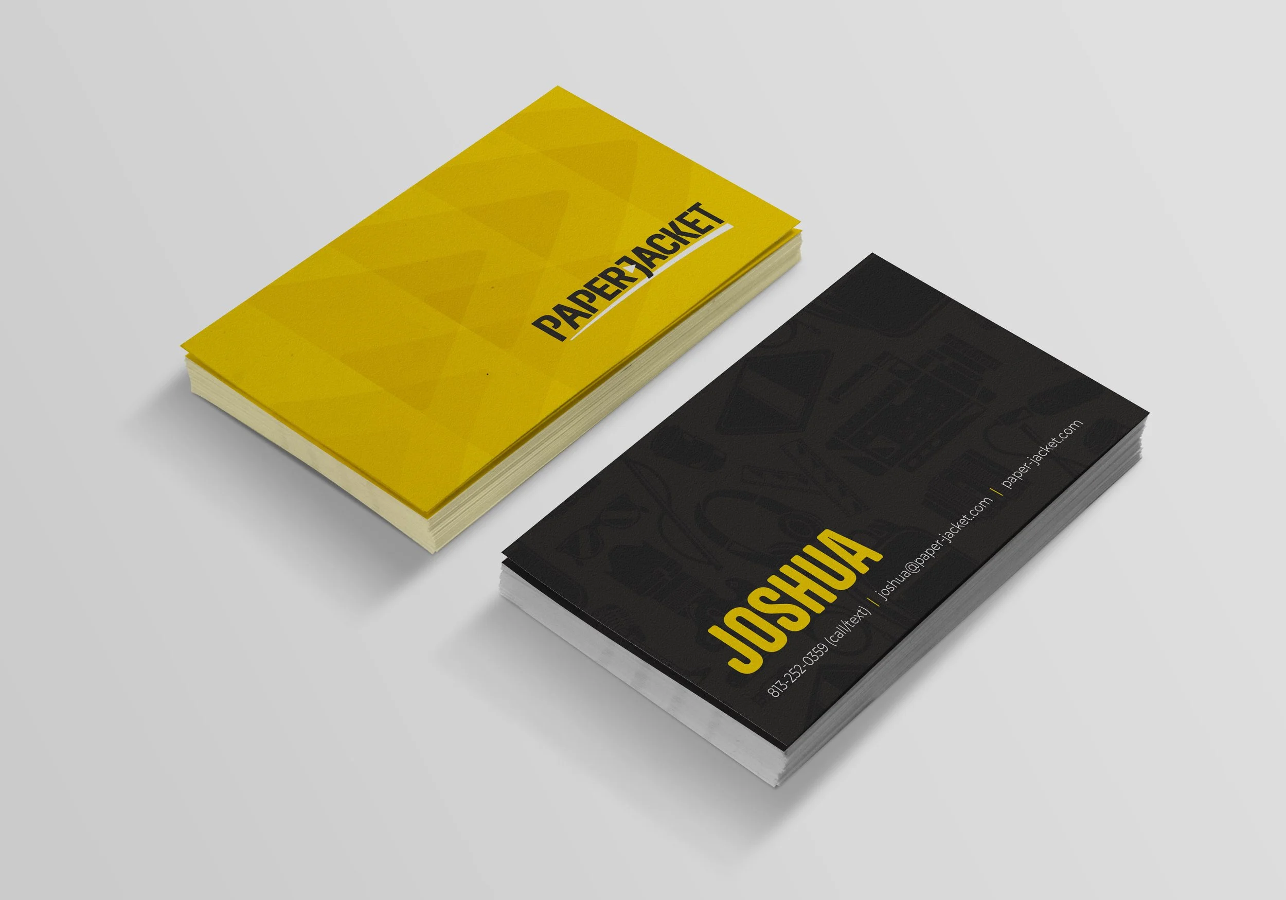
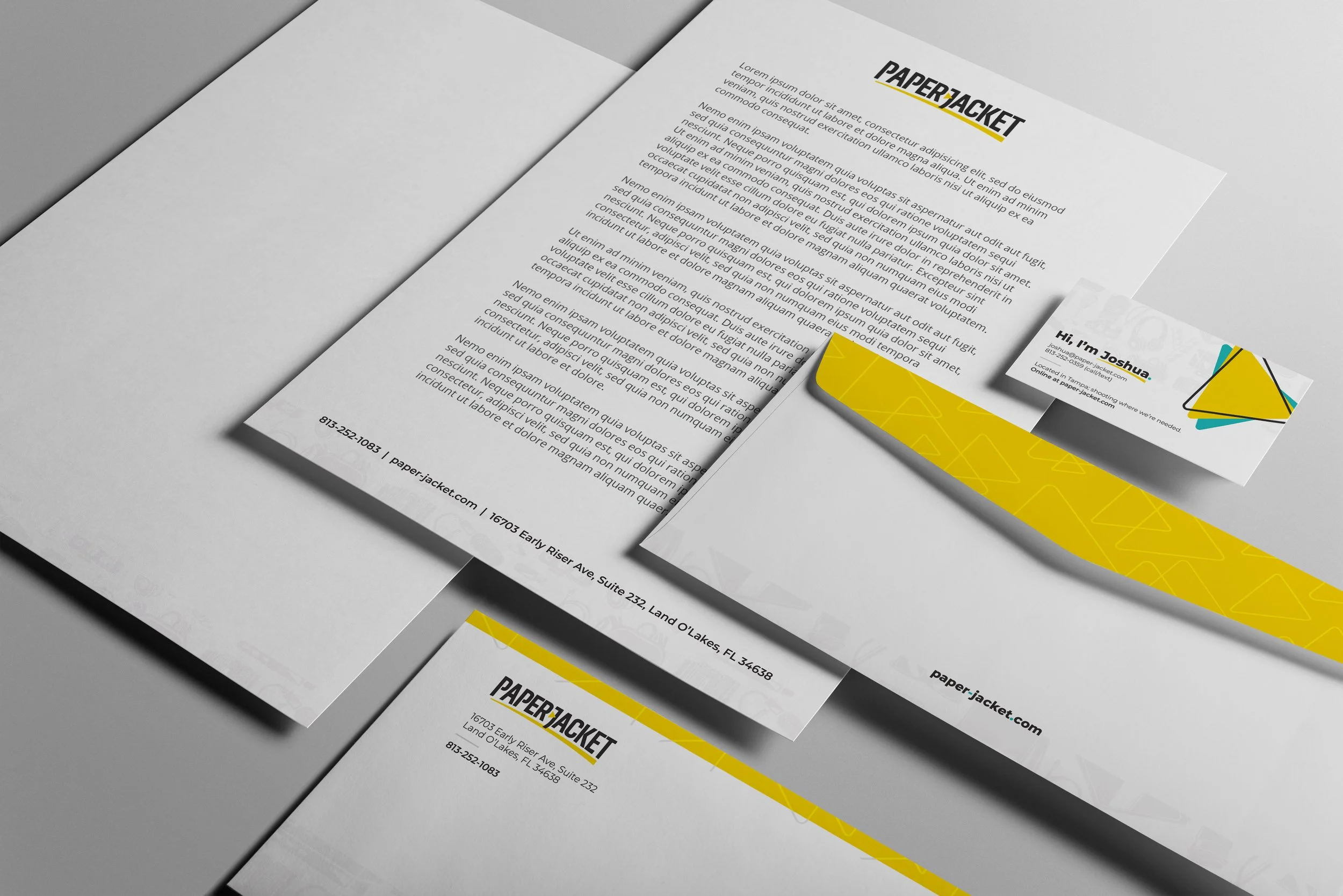
Paper Jacket approached us for a brand refresh as they pivoted away from offering general marketing services to focus exclusively on video production. The first step was updating their logo to reflect this new direction. We transformed the hyphen into a play button—an immediate and recognizable symbol of video—to reinforce their core offering. The custom typeface, along with a subtle curve in the letterforms, adds a sense of motion and energy that reflects Paper Jacket’s fun, creative spirit.
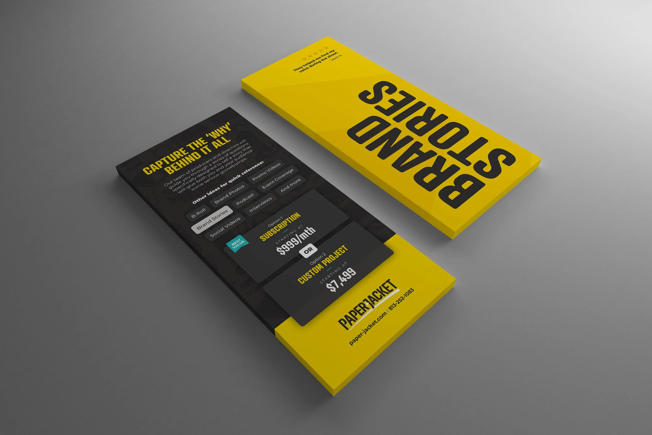
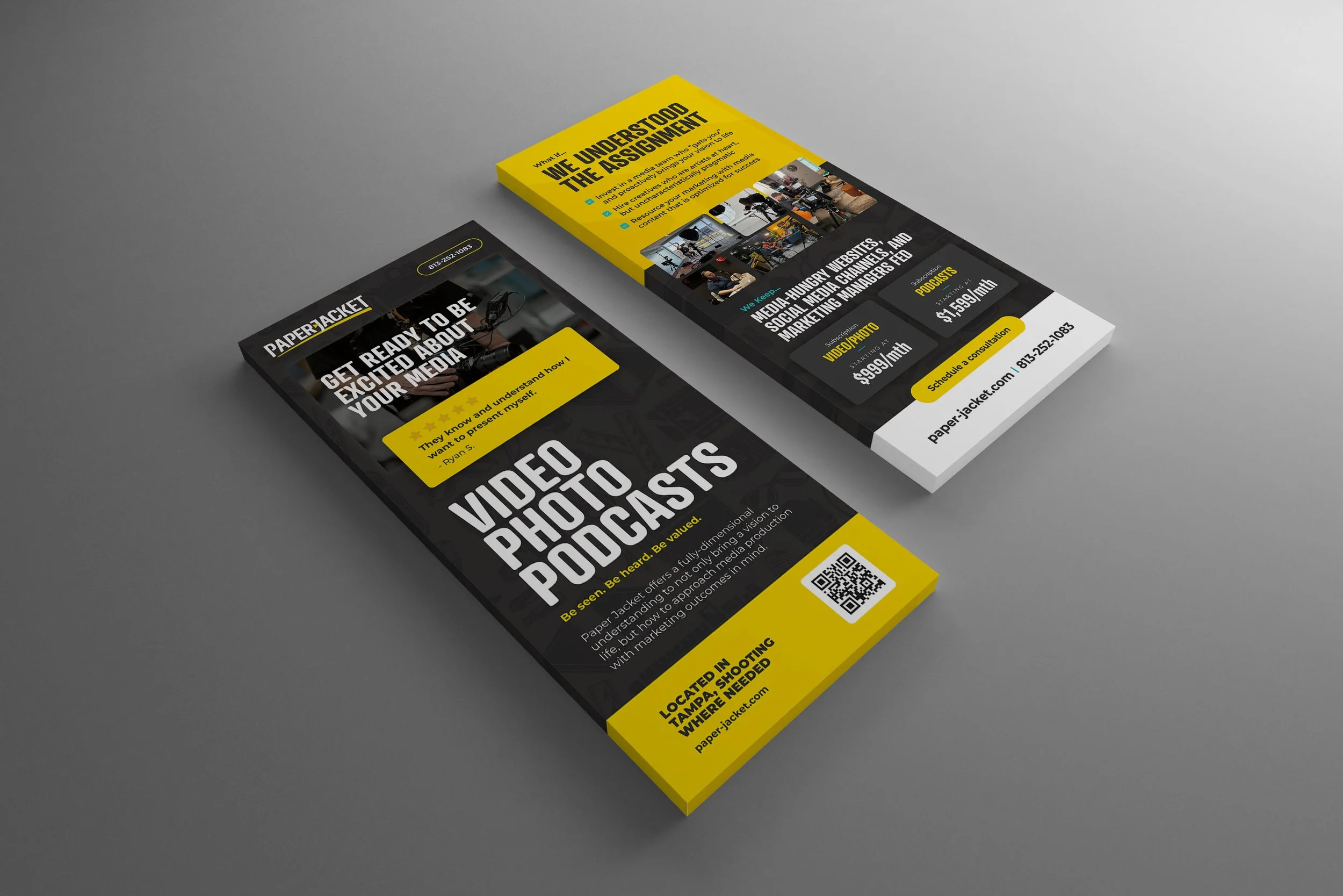
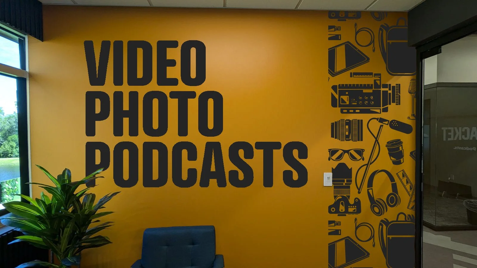
For the broader visual identity, I wanted to integrate both the essence of the logo and the nature of their work. I developed two custom patterns to bring the brand to life across various touchpoints. The first is a play button pattern, used to anchor text and images while suggesting movement—a subtle visual cue that ties back to video. The second is an equipment pattern composed of custom icons representing the tools used in their four key service areas: video, photo, and podcast production. Additional icons like headphones, sunglasses, and coffee cups reflect the unique personality behind the brand.
The goal for the branding was to strike a balance between boldness and simplicity—creating a look that’s minimal and impactful, yet still full of personality. It communicates Paper Jacket’s identity clearly and memorably, without relying on excess or over-explanation.

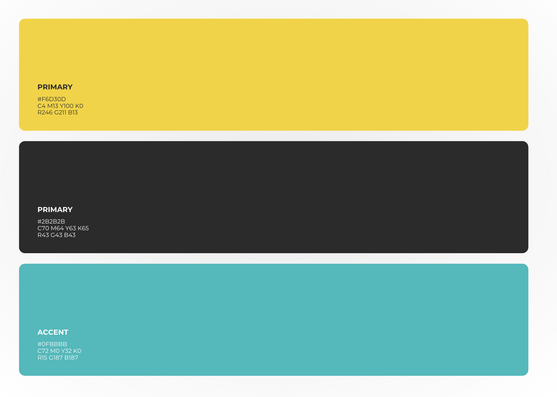
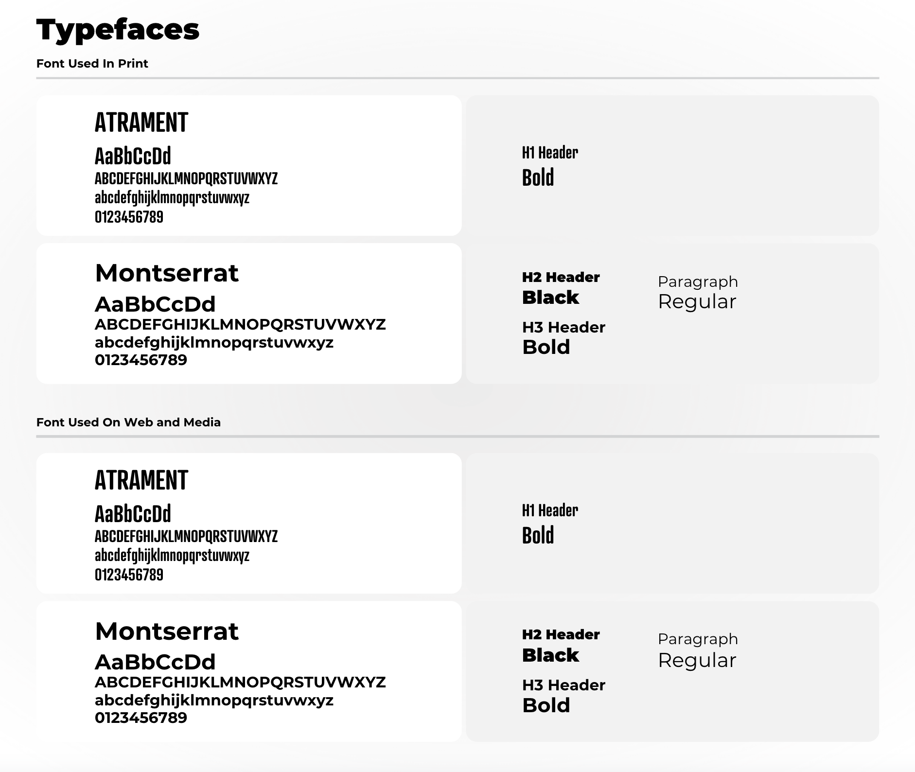

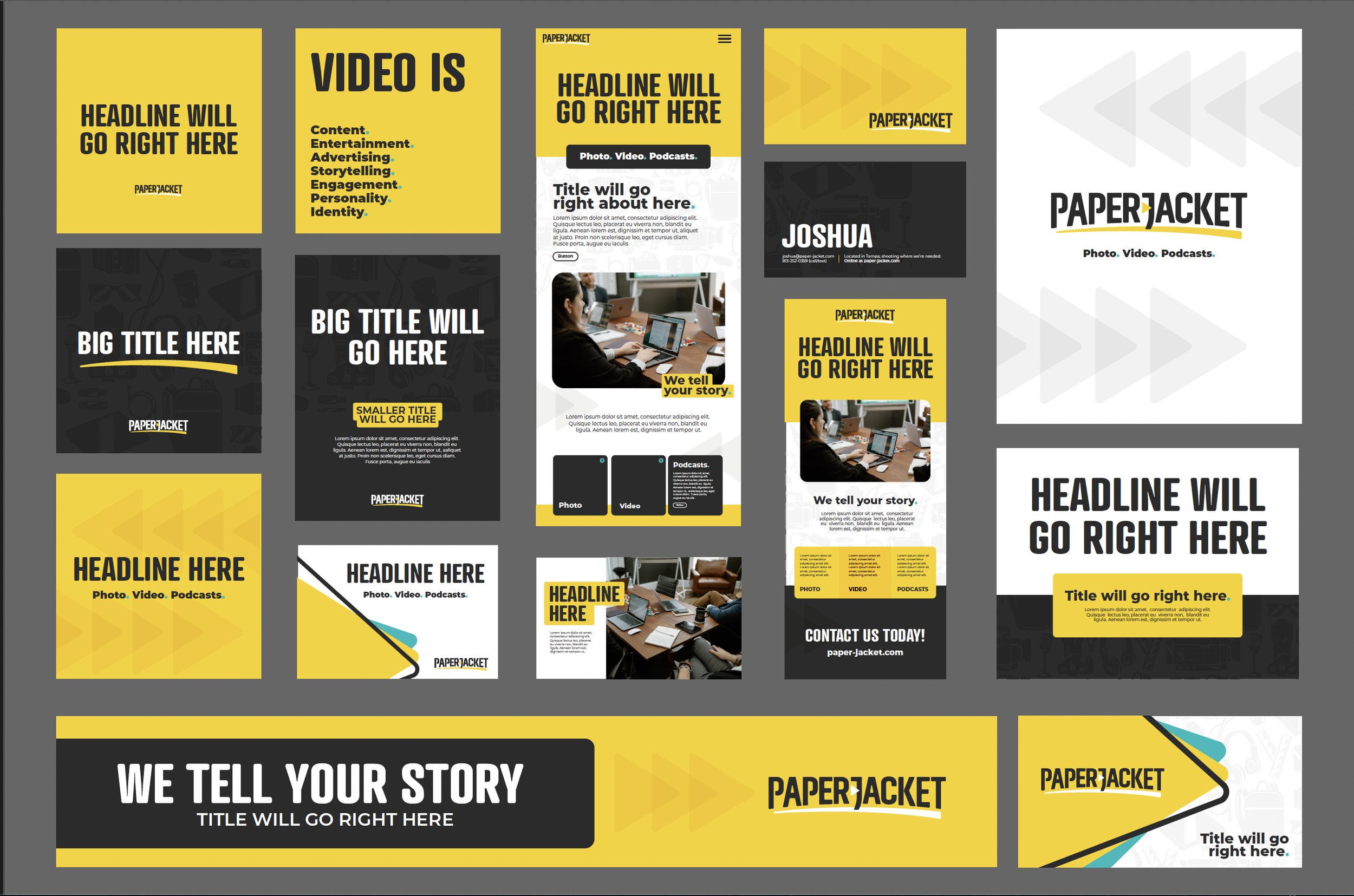
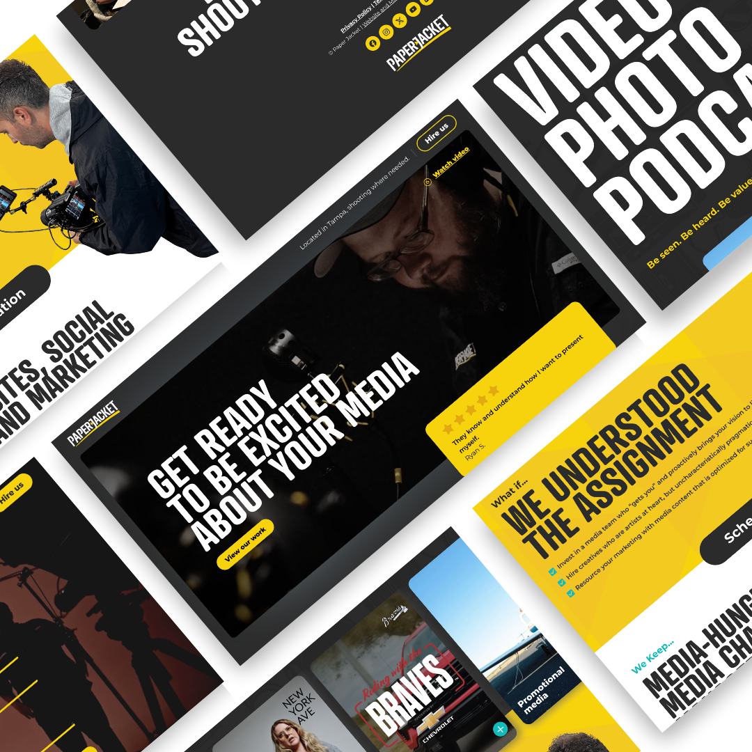
The Branding starts with the logo, that sets the stage for what kind of personality a brand will have. That personality then starts to take shape in the stationary and marketing elements, I start to create assets like illustrations, custom icons, patterns and typefaces to help tell the story of the company. Those elements and tone then gets flushed out in a website, putting all the elements together. Since Paper Jacket created bold, fresh, eye-catching content in video, photo and audio form I had to make sure their brand reflected their work.
© New York Ave. and Paper Jacket