
Branding + Design + UI/UX Layout design
Bee Realty
Bee Realty had already built a strong presence and reputation in the local community. What they needed wasn’t a full rebrand, but a refined and more consistent visual identity—one that could unify their materials, elevate their presentation, and increase brand recognition while preserving the essence of what made them unique.
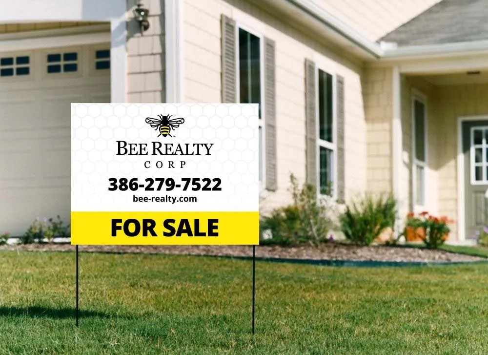
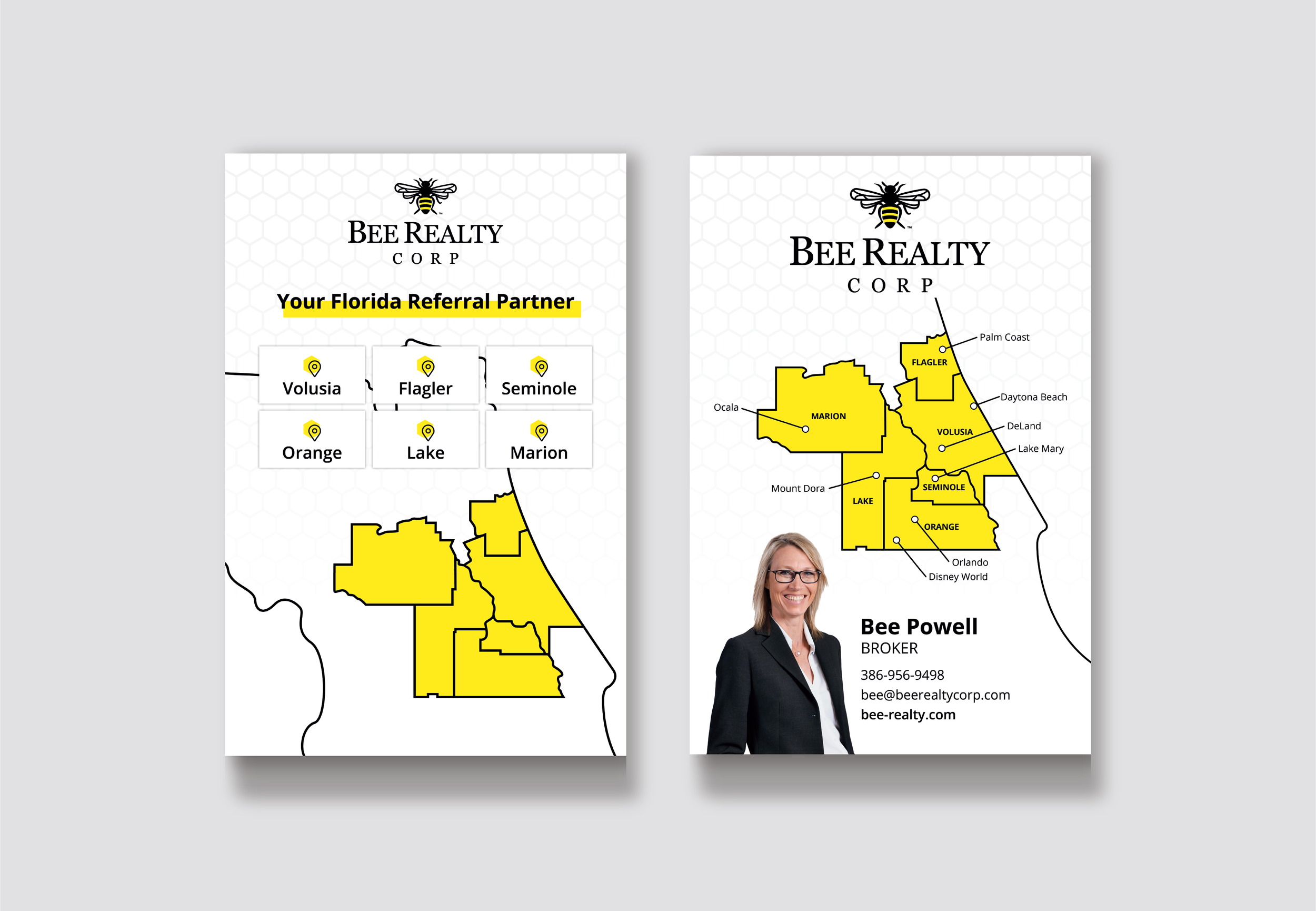
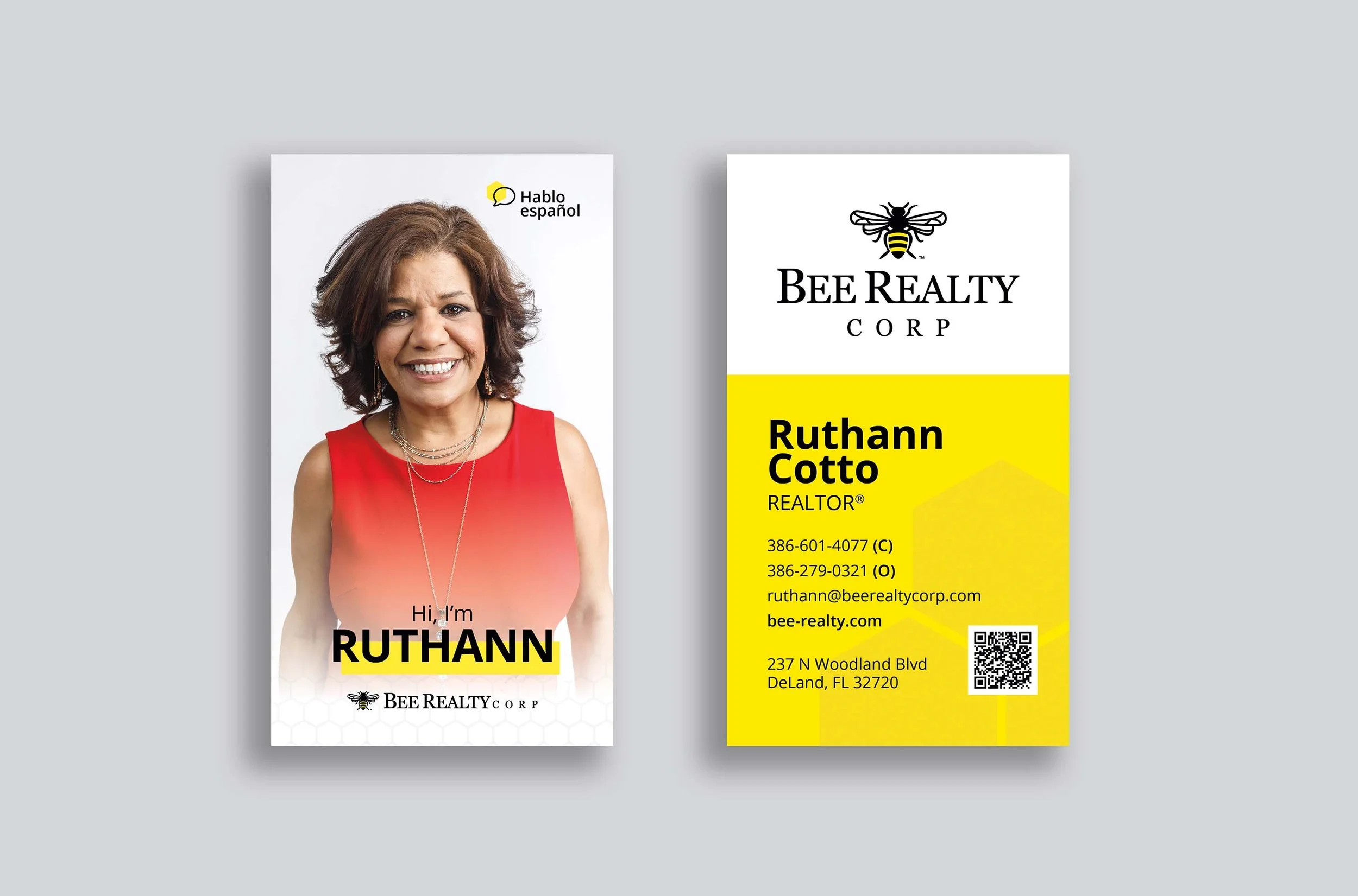
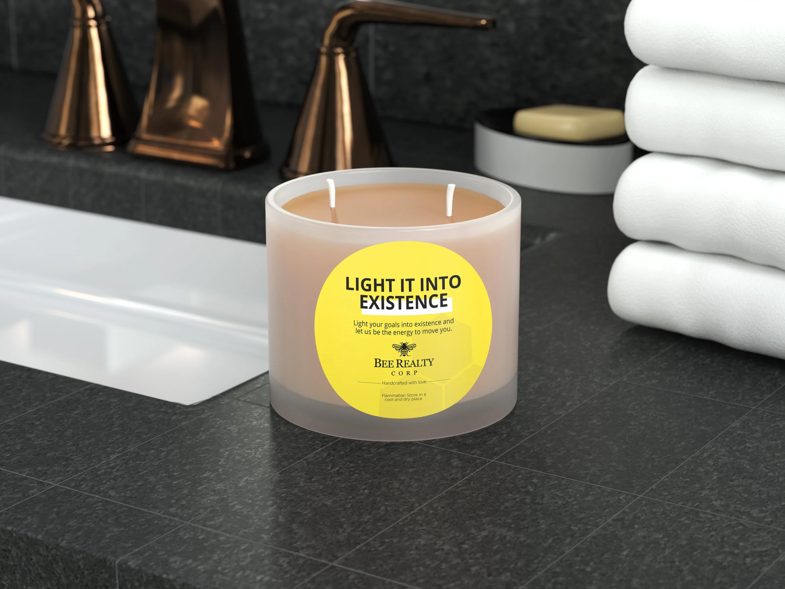
At the heart of their brand was the bee motif, which symbolized community, hard work, and trust—values core to Bee Realty’s mission. I chose to lean into that symbol and expand upon it, developing a cohesive visual system that revolved around the concept of the hive. This included introducing a clean, modern hexagon pattern inspired by a honeycomb, which became a unifying graphic element used across print materials, signage, social media, and the web.
I also created a set of custom icons and graphic accents based on the bee and hive concept, which added personality and clarity to both digital and physical brand touchpoints. These elements helped build visual consistency and made the brand feel more intentional and thoughtfully designed.
A key part of the refresh involved refining the color palette—most notably, selecting a more vibrant, saturated shade of yellow that maintained the brand's sunny personality while making it more visually impactful across mediums. Paired with a clean secondary palette and modern typography, the updated color system added energy and approachability to the overall look.
By taking existing brand elements and building a more structured, recognizable system around them, I helped transform Bee Realty’s presence into one that feels professional, cohesive, and above all—memorable. The refined brand communicates reliability and warmth while standing out confidently in a competitive real estate market.


© New York Ave. and Bee Realty Corp